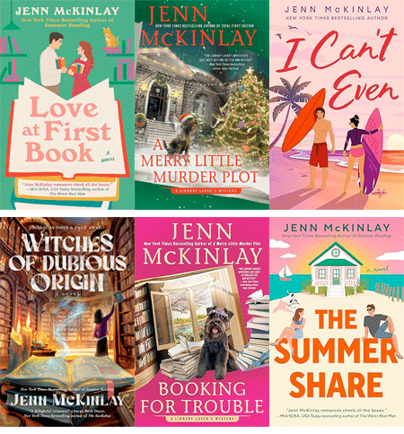
JENN McKINLAY: I may or may not get into trouble for sharing the evolution of my most recent book cover. Maybe I should ask first but I long ago discovered it's easier to get forgiveness than permission.
So, my upcoming 2026 romcom THE SUMMER SHARE just had its big cover reveal. It came out great I'm thrilled, but how did we get there?
About a year out from publication, my publisher always asks what I want on the cover. Given that this is a story about two people who inherit a cottage in the Outer Banks only to discover when they get there that it's a shared inheritance, I knew right away I wanted a cottage on the cover, a beach, our heroine, our hero, and the heroine's Great Dane named Dude, or "El Duderino, if you're not into the whole brevity thing" -- bonus points if you can name the movie that quote comes from!
Being ever helpful, I sent my publisher a mock up (with notes) of what I thought the cover could look like.
There was some debate about changing the cover from my previous romcom styles (see my website for examples). It's the old debate about whether or not "cartoon" covers were out of fashion, etc. Given that I write comedy, I feel like a cartoon cover is a good heads up about what you're going to get but what do I know?
A couple of months passed and I received three options for the new cover. Wow!
How great are these? I sent them to everyone I know (the Reds can testify this is true) and asked for help with choosing. I mean, they're all amazing. I felt like I was tasked with the impossible. The colors on book one dazzled, the blue water on book two was so inviting, and the cottage with the couple sitting on the title was ridiculously charming. After several weeks of debate, my editor and I picked our favorite elements from the covers and sent our thoughts back to the art department. And this is what they came back with: Perfection!
.jpg) |
| PRE ORDER NOW (May 2026) |
You can see the final is vastly different than the mock up I sent in and yet it captures the vibe I was hoping for. This is why I'm a writer and not a cover artist.
So, what do you think, Readers? Did the art department do right by me? There is no wrong answer here as art is purely subjective.
More about the book:
When two misfits discover they’ve inherited the same beach house, sparks fly in the most unexpected ways, in this hilarious and heartfelt rom-com from the New York Times bestselling author of Summer Reading.
Free-spirited travel influencer Hannah Spencer has spent five years touring the country in her vintage van. An unexpected inheritance from her Pops brings Hannah to Cape Split, North Carolina, where she learns she’s the new owner of a worse-for-wear seaside beach house. Or, rather, fifty percent of one. Turns out Simon O’Malley inherited the other half from his Gramps.
As Simon and Hannah spend the summer tag-teaming repairs on the crumbling cottage, they discover the house was once home to a timeless love story. Soon, they begin to wonder if the house’s romantic past may be a good omen for their future together. But there’s one problem—Simon is set on selling the property at the end of the summer.
Hannah thought one summer at the Split would be enough, except it isn’t like any place she’s ever been, and Simon isn’t like any man she’s ever known—and she’s thinking about putting down some roots. She just needs Simon to see their budding relationship and this newfound community the same way or their first summer share might also be their last.


It's fascinating to see the evolution of the cover, Jenn . . . I love the final version and think it fits the story perfectly . . . .
ReplyDeleteThank you, Joan!
DeleteOooh, I love the combination of elements from covers 1 and 3: the sunset and house with the two leads (her arms crossed) and the dog!
ReplyDeleteThe dog steals the book. :)
DeleteI love the cover, Jenn!!
ReplyDeleteThank you, Annette!
DeleteThe final result is great and fits the description of the story well.
ReplyDeleteI actually like your mockup that is more a real photo than a drawing best, especially the dog.
Thank you! I was going for an old school romcom (like Doris Day) vibe.
DeleteThe final one is perfect! Occasionally I have gotten a final cover that has an element I didn't include in the book - but should have! Usually I have time to pop it in.
ReplyDeleteWow, Edith. That could be frustrating, instead you make it work.
DeleteHa! I had to cram a cat into my last romcom because one showed up on the cover!
DeleteIt's a great cover, Jenn! Thanks for showing us how this one evolved.
ReplyDeleteThank you!
DeleteLove it Jenn and can't wait to read! You are so clever to be able to send that design to your publisher so they can see exactly what you're thinking. I usually do that in words, which doesn't always translate:)
ReplyDeleteI always create a Pinterest board with pix of some of the elements I want them to include and send the link along with the words to my editor. But I never get to see drafts before the final one. The few times I asked for changes, they got snippy about it. ;^(
DeleteI started sending visuals because describing it was too hard - ha!
DeleteI think it's great! (Selden)
ReplyDeleteThank you!
DeleteI love all of the covers. The combination picked for the book cover is beautiful. I noticed Simon is wearing sunglasses 🕶️. I love the cartoon version on the cover, though I loved the real life look of Simon. Look forward to reading the Summer Share in ? 2026 ?
ReplyDeleteMAY 2026!!!
DeleteI like it! It’s colorful, the woman’s arms crossed and the man wearing shades conveys a little bit about them and I even like that the title went from cursive-like to block print. Now the man wearing sunglasses might just mean he cares about his eyes, but it looks like he’s cool/laid back and she looks a little buttoned down. All of which will be revealed within the story, right? Thanks for sharing the process, Jenn! — Pat S
ReplyDeleteThank you, Pat!
DeleteYou done good, Jenn! Absolutely perfection and I cannot wait to read it!
ReplyDeleteYay! Thank you!
DeleteThe art department did great! I would also have picked the third option. I'm looking forward to reading it in a year or two. My sisters and I visited the newly renovated Central Library last week (it's beautiful, and kept the gracious spaciousness of the building where mom worked when we were kids) and I picked up About A Dog. I'm sure I will love it, as I am also enjoying your Library Lovers series.
ReplyDeleteAw, I loved writing that book. Thank you!
DeleteThis is fascinating, and though I love the final cover, I do think your original mockup was fabulous and I'd have been for a non-cartoon cover. Either way, I think the final cover captures what yuo were hopo8ig for and I can't wait to read it!
ReplyDeleteThank you, Hallie!
DeleteThe Dude abides! The Big Lebowski, of course.
ReplyDeleteLove the end result, Jenn, and thanks for sharing the process. Fascinating to see the evolution!
I have designed exactly one cover, and I still cringe when I see it, it's so blah. The '90's author photo, complete with out-to-there shoulder pads, doesn't help one bit. LOL It's great that YOU get to give input for covers; when Betterway published one of my books--a how-to guide to having a sewing BUSINESS--the cover was such a disappointment, very "Becky Home-ecky". A tomato pincushion outside; inside, industrial sewing machines. Oy.
Karen I have been thinking about you and your lemon tree and have no other way to contact you. Hope it is flourishing!
DeleteI thought that might be from TBL!
DeleteThis comment has been removed by the author.
DeleteThanks Karen, but there are several with your name on FB, and honestly, none of them really sounded like you. Maybe try to friend me - Judi Purcell - not sure how many of them are out there.
DeleteThis comment has been removed by the author.
DeleteYES!!! Love that movie. Well done, Karen.
DeleteHow cool Jenn. It's so nice to see how things work from the inside so to speak.
ReplyDeleteIs there some research by publishers to know if cartoon covers vs. non-cartoon sell better?
The very first mock up you showed us actually was my favorite (except I'd like the guy to be frowning) and drew me in and made me want to find out what they're up to.
They spend a lot of time trying to predict the market - not sure how accurate it all is but...
DeleteAll the covers are so cute-and love the final one! Sounds like a fun book too. I spent some time in the Outer Banks when we lived in Virginia and it is a unique place (I assume many of you have seen Nights in Rodanthe? That house exists and in a precarious part of the area). This is going on my “to buy” list for sure!
ReplyDeleteThank you, Stacia!
DeleteI like the various elements that were pulled from the mock ups and blended into the finished cover. I am especially glad they kept the characters sitting on the title and I really like that they put sunglasses on the guy, but left her eyes/face uncovered. The little touches can make a big difference. -- Victoria
ReplyDeleteRight? It is the little things.
DeleteI absolutely adore this cover, Jenn, and I love seeing how it evolved! It's the perfect combination of all the elements, and I especially like the block letter title with the characters sitting on it. The colors are gorgeous and I'd grab this off a bookshelf in a heartbeat. Oh, and I want the dog!
ReplyDeleteLOL, thanks, Debs!
DeleteCongrats, Jenn! All the cover elements suggest so much about the ambiance, one of fun and intriguing tension in an inviting setting.
ReplyDeleteThank you, Priscilla. I'm pleased with how it's all coming together.
DeleteI like that the sky is the peachy colors. It's a great contrast to the sea.
ReplyDeleteThank you, Deana.
DeletePerfect! I love cartoon covers for romcoms! Give the art department a raise!
ReplyDeleteYes, definitely!
DeleteI love seeing and hearing what went into producing this great final cover.
ReplyDeleteThank you, Kim!
DeleteI think the final cove is definitely perfect! I like the way everything is closer up, like the house and the couple. I thought the house was too far back on the others and the people too small. There's a great blend of colors on the final cover, too. I love covers, and if or when I start my blog back, I think I'll do something on my favorite covers. Jenn, I think this book is going to be a great success.
ReplyDeleteThank you, Kathy! It is amazing what covers stick with us, isn't it? That'd be a great blog post.
Delete