DEBORAH CROMBIE: The REDs are such a busy, productive bunch--some of us are turning out two, three, or FOUR books a year! Honestly, this just boggles my mind, and I suffer from a constant case of underachiever syndrome.
I wrote my first four books in a year each, but then as the books got longer and more complicated, I got...slower. Enter the latest, Kincaid/James #19, and with the lack of research trips combined with all the general pandemic worry and muddle, my progress has been GLACIAL.
HOWEVER, the end is now in sight!!!!!!!!!!! Like the tortoise, I will get there, and in just a few more weeks. Excuse my messy desk, but that pile of pages is starting to look like a book!

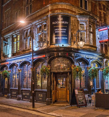
I have a COVER, too! And as the book is up for pre-order here and here, I'm going to share it with you!

I think it's fabulous. It's exactly what I imagined for this book, and I especially love that the image is the Bloomsbury Tavern, one of the oldest pubs in London. The Bloomsbury was once the ominous final watering hole en route to the hangman's noose at Marble Arch. Isn't that perfect for a crime novel?


But this was not arrived at instantly, I can tell you. Covers are very much a collaborative effort. I wanted a book that said Bloomsbury. My photographer friend in London even spent an afternoon shooting locations in the area for me, but nothing quite worked. I especially liked the idea of using a pub, but every place he checked had big Covid-restriction signs in the windows, and all the passersby were masked. Not photogenic at all!
But eventually, between my agent, my editor, the publisher's art department, and me (spending many hours on Google Images,) we came up with the image above.
I want to walk right in that open door.
So of course I had to set a scene in the Bloomsbury, but I'm only going to share a couple of sentences, because otherwise it is a SPOILER. Even in this little snippet, I've substituted pronouns for the proper names. This far along in a story, anything can be a spoiler!
He set a quick pace down New
Oxford Street, and when she spotted the triangular, ornately embellished red
brick building with its green spire, she guessed where they were
going. “The Bloomsbury Tavern.”
“Can’t get much more un-trendy
than this,” he said as they reached it. “And the beer is better.”
Welcoming light spilled from the pub’s distinctive leaded windows, and when he opened the door they were met with a wave of warmth and the comforting smell of chips frying.
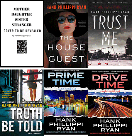
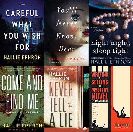
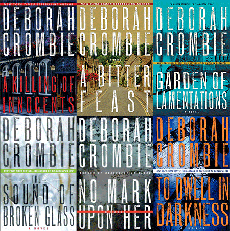
Readers, do you like authors to have a "brand" with their cover designs? My first five books were with the same publisher, but the cover design and concept of each one were completely different. The next three books, different publisher, same problem--and one of the covers looks like an historical novel. Such a shame as it's one of my favorite books in the series, AND JUSTICE THERE IS NONE. (The same art work did show up a year or so later on another author's Victorian-set novel!)
After that, my first few covers with William Morrow were fun because we used my photos. But, then, with NO MARK UPON HER, we moved to a "bigger book" (as they say in the publishing business) design.

What do you think, REDs and readers? Does it look like a Gemma and Duncan novel? And do you notice if an author's covers have a certain style?