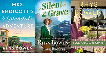
 I'm thinking about this because I have anew Molly Murphy book coming out next Tuesday and I had to request some cover changes. The first cover had Molly wearing a cloche hat and a low slung belt, looking very Twenties instead of 1905. When I brought this to my editor's attention the artist said that he had a picture of that very hat in Paris 1905. So they were always ahead of the times in Paris, but it still looked 1920.
So the hat was changed, the belt was removed and Rhys was a happy camper. But it reminded me how important it is that the cover gets the flavor, the time, and the type of book just right. The reader is seriously miffed if the cover promises one type of book and she gets another. This happened to me once, many years ago when I wrote historical romances. At least I didn't think the first one as a historical romance. I thought it was a historical novel (with a touch of romance). But it came out with a cover with the blouse hanging off one shoulder, red hair cascading down her back and Fabio standing behind her. Doomed. No man would ever read it and the women readers would be disappointed because the romance wasn't the driving story.
I've just spoken at the San Francisco Writer's conference and Mark Coker of Smashwords spoke on the importance of cover when selling an e-book. The words have to be big enough to read in thumbnail. You can't make it too light or it blends into the white page and it has to shout out what kind of book it is. Not easy for something that appears about an inch big on Amazon.
But his rules are true for all of us. Name and title big enough to read across the room, appealing colors and must shout out what kind of book it is.
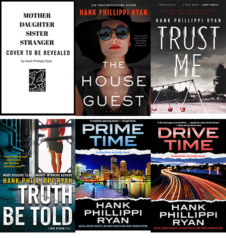
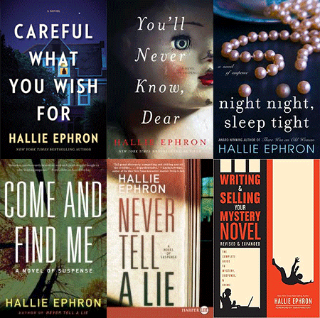
 I ran a poll recently on my Facebook page (www.facebook.com/rhysbowenauthor) about the importance of cover and quite a few people said "That's how I found your books." Almost everyone agreed that the cover first drew them, then they read the blurb on the back and maybe the first page or so. I think Hank's The Other Woman illustrates just perfectly all the points made above: great design. Says exactly what kind of book it is. Words big enough to read.
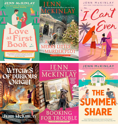
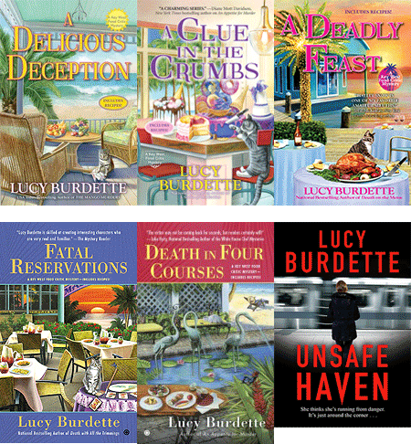
 While Lucy's promises the kind of cozy fun we're going to get.
My Constable Evans books had covers much cozier than the books. Every one had some kind of farm animal on it and I once announced that I had won the Old Macdonald award. Everyone clapped until I said "for the most farm animals on covers." But I think in my case the cover put off some serious mystery readers.

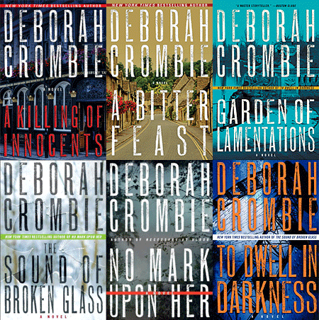
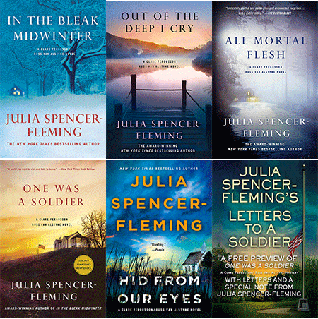
And now the trend for big names is to have just name and title huge on cover and not much else. Look at Deb's upcoming book
Or Louise Penny's.

So what do you like? Do you want a picture on the cover, showing you what sort of book it is? Does the cover draw you to buy a book? Have you ever been misled by a cover and disappointed that the book did not live up to the image?