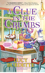

Of course I knew what this was: a Heilan coo, a Scottish breed of rustic cattle indigenous to the Scotland Highlands. However, these animals have a very small cameo in Scone—think background wallpaper. This was cute, but I wasn’t sure this artwork would draw new cozy mystery readers. Ps, what has the animal gored? I think it’s supposed to be scones or baked goods, but I hope it wasn’t… The victim.) in this case I did not have any cover consultation rights so all I could do is think that it would make for a great blog!
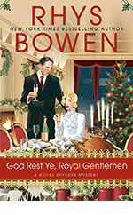
RHYS BOWEN: These days I have complete cover input and approval. For my big stand-alones, there is a lot of back and forth and haggling between me, who knows what my book is about and marketing (who are all twenty-something computer geeks who only go by algorithms) but in the end we come up with a good compromise. Sometimes it’s brilliant right away. The Tuscan Child we all loved instantly. The upcoming book, The Rose Arbor, has had many title changes and thus covers before we are all satisfied.
In contrast the Royal Spyness series has had the same illustrator since day 1. I know him. He lives in San Francisco. He asks me what I want and voila. There it is. Perfect.

My very first series, Constable Evans, when I had zero clout, was the artist’s impression of Wales and all the covers had sheep or goats on them. Perhaps this is a requirement for a cozy mystery in the UK. Cozy fans love cats, therefore also have a soft spot for sheep, goats and highland cattle!
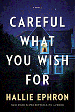
HALLIE EPHRON: I got sent two possible cover illustrations for two DIFFERENT books that were nearly identical - a massive steam-punk-looking padlock on a field of blue/black. Perfect if I’d written Bluebeard. The first cover sent me for my updated writing books was a murky green forest. (I said to them, it’s a WRITING BOOK!)
“Please, start over.” And they did.
But I confess I do love Highland cows and if they’d sent me a book cover with one of them, even though my books have none, I’d have been tempted to rewrite the book to shoehorn one in.
Rhys’s book covers are a good study in how the different subgenres are telegraphed by the cover styles. Very effective.
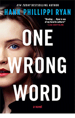
HANK PHILLIPPI RYAN: Oh, gosh, Lucy, I am still laughing over that creature–which I will admit when I first saw it, I thought: WHY does Lucy have a buffalo on her cover? Okay, I get it now, but I am distressed by its nose. And the things on the horns. I would ONLY (but instantly) buy this if I knew it was YOUR book.

This is the UK cover of TRUST ME. It’s so UK! First, the publisher did not want me to be Hank Phillippi Ryan, and wanted a more instantly female name. Okay, so much to discuss about this, but here it is.
What I am fascinated by is the cut line. “She may be a bad mother, but is she a killer?”
I’m not sure that’s the way I would have gone with it, but I always try to remember that publishing execs in other countries are aiming for THEIR readers, not for me.
(I did get a wonderful email from the woman who posed for the cover–which is somewhere in my photos and absolutely unfindable.)
As for my current covers, it’s a wonderful collaboration, and truly fun and rewarding and fascinating, and my publisher’s art department is genius. AND I am allowed to say no. So that’s great.
JENN McKINLAY: I am fortunate that I have never had a bad cover, not one, not ever. Like Rhys, I am fortunate that the publisher asks me what I want and then the art department delivers something that’s so much better than my wildest expectations. Now I am going to burn a candle to the cover gods because I don’t want to jinx myself. LOL.
DEBORAH CROMBIE: Lucy, the more I look at your Highland Cow, the more adorable I think it is. (He? Do the girls have those horns, I wonder?) But I'm not sure that I would instantly get that this is a food-themed cozy mystery.
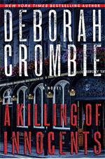
I've had such a checkered career with the Cover Fairies. I had NO say with the first few books. While the first two were charming, they looked like English historical cozies, not contemporary procedurals. But #3, LEAVE THE GRAVE GREEN, was absolutely awful. Where would you say this book was set?

Not in Henley-on-Thames, where a body is found in a lock. Or in the gorgeous green and mysterious Chiltern Hills, or in the world of the English National Opera, where part of the book takes place. Sigh. I feel fortunate that anyone bought it.
I do have cover approval these days, thank goodness, but it's very much a collaborative process. For a while my publisher used my photos, which was great fun, but then they went for a "bigger book" look. I know we always love our most recent books best, but I do think that my latest cover is my absolute favorite of all of my books.
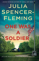
JULIA SPENCER-FLEMING: I’ve been blessed by the cover gods in that none of my published books has had a clunker. After the first book, Minotaur settled on a “vaguely foreboding rural scene” theme which has worked well.
However, when ALL MORTAL FLESH was in the process, someone had the bright idea to rebrand the cover to emphasize the obviously popular romance angle, and I got a couple artists’ concept mock-ups that I refer to as “my vampire covers.” One has the face of a beautiful woman in her twenties, staring toward an off-screen sunset, with a gorgeous guy in his thirties, also in profile, right behind her. This, I understood, was to represent Clare, a 36 year old with a “plain face” “all points and angles”, and Russ, a rugged 50 year old with graying hair and glasses. Huh.
The second one was even worse, if you can imagine it: it took the male model away and had the woman’s face, still in profile, hovering over a very pointy church spire, giving the effect of a giantess about to suffer a horrible injury to her soft palate.
Lucy, I swear, I looked everywhere for these pictures; I think I must have deleted them in horror. The cover they eventually used was based on a sketch I did, after a fairly heated discussion, seated at the St. Martin’s booth at the old BEA (How I miss it! Yes, the Javits Center was awful, but still.)
Question of the day: Reds, tell us about your most unusual (or other adjectives) cover.
Readers tell us about a cover that particularly drew you in or repelled you from reading a possible book.