
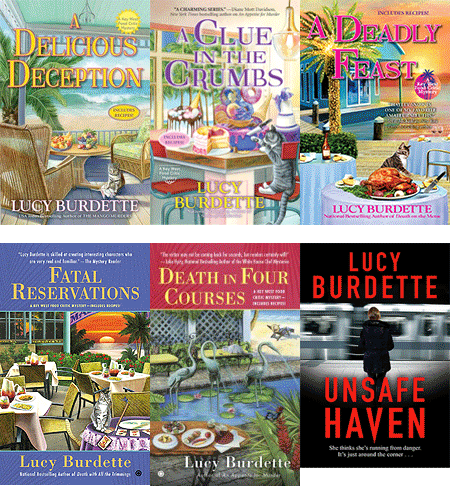
Of course I knew what this was: a Heilan coo, a Scottish breed of rustic cattle indigenous to the Scotland Highlands. However, these animals have a very small cameo in Scone—think background wallpaper. This was cute, but I wasn’t sure this artwork would draw new cozy mystery readers. Ps, what has the animal gored? I think it’s supposed to be scones or baked goods, but I hope it wasn’t… The victim.) in this case I did not have any cover consultation rights so all I could do is think that it would make for a great blog!
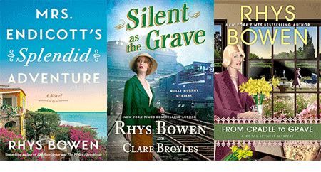
RHYS BOWEN: These days I have complete cover input and approval. For my big stand-alones, there is a lot of back and forth and haggling between me, who knows what my book is about and marketing (who are all twenty-something computer geeks who only go by algorithms) but in the end we come up with a good compromise. Sometimes it’s brilliant right away. The Tuscan Child we all loved instantly. The upcoming book, The Rose Arbor, has had many title changes and thus covers before we are all satisfied.
In contrast the Royal Spyness series has had the same illustrator since day 1. I know him. He lives in San Francisco. He asks me what I want and voila. There it is. Perfect.

My very first series, Constable Evans, when I had zero clout, was the artist’s impression of Wales and all the covers had sheep or goats on them. Perhaps this is a requirement for a cozy mystery in the UK. Cozy fans love cats, therefore also have a soft spot for sheep, goats and highland cattle!
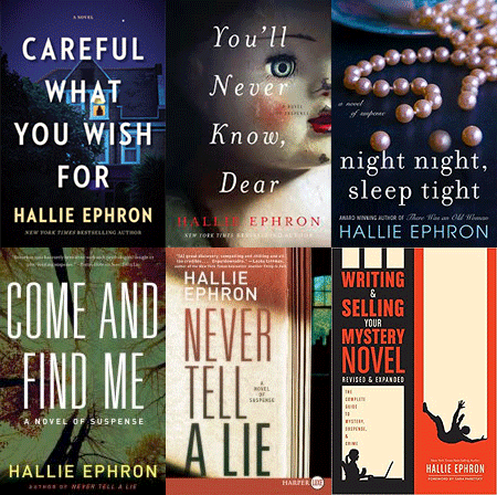
HALLIE EPHRON: I got sent two possible cover illustrations for two DIFFERENT books that were nearly identical - a massive steam-punk-looking padlock on a field of blue/black. Perfect if I’d written Bluebeard. The first cover sent me for my updated writing books was a murky green forest. (I said to them, it’s a WRITING BOOK!)
“Please, start over.” And they did.
But I confess I do love Highland cows and if they’d sent me a book cover with one of them, even though my books have none, I’d have been tempted to rewrite the book to shoehorn one in.
Rhys’s book covers are a good study in how the different subgenres are telegraphed by the cover styles. Very effective.
HANK PHILLIPPI RYAN: Oh, gosh, Lucy, I am still laughing over that creature–which I will admit when I first saw it, I thought: WHY does Lucy have a buffalo on her cover? Okay, I get it now, but I am distressed by its nose. And the things on the horns. I would ONLY (but instantly) buy this if I knew it was YOUR book.

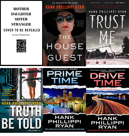
This is the UK cover of TRUST ME. It’s so UK! First, the publisher did not want me to be Hank Phillippi Ryan, and wanted a more instantly female name. Okay, so much to discuss about this, but here it is.
What I am fascinated by is the cut line. “She may be a bad mother, but is she a killer?”
I’m not sure that’s the way I would have gone with it, but I always try to remember that publishing execs in other countries are aiming for THEIR readers, not for me.
(I did get a wonderful email from the woman who posed for the cover–which is somewhere in my photos and absolutely unfindable.)
As for my current covers, it’s a wonderful collaboration, and truly fun and rewarding and fascinating, and my publisher’s art department is genius. AND I am allowed to say no. So that’s great.
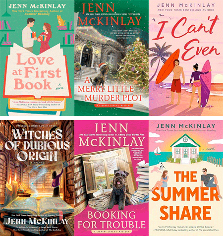
JENN McKINLAY: I am fortunate that I have never had a bad cover, not one, not ever. Like Rhys, I am fortunate that the publisher asks me what I want and then the art department delivers something that’s so much better than my wildest expectations. Now I am going to burn a candle to the cover gods because I don’t want to jinx myself. LOL.
DEBORAH CROMBIE: Lucy, the more I look at your Highland Cow, the more adorable I think it is. (He? Do the girls have those horns, I wonder?) But I'm not sure that I would instantly get that this is a food-themed cozy mystery.
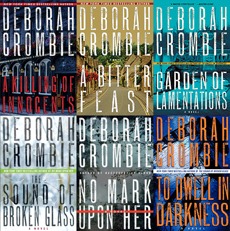
I've had such a checkered career with the Cover Fairies. I had NO say with the first few books. While the first two were charming, they looked like English historical cozies, not contemporary procedurals. But #3, LEAVE THE GRAVE GREEN, was absolutely awful. Where would you say this book was set?

Not in Henley-on-Thames, where a body is found in a lock. Or in the gorgeous green and mysterious Chiltern Hills, or in the world of the English National Opera, where part of the book takes place. Sigh. I feel fortunate that anyone bought it.
I do have cover approval these days, thank goodness, but it's very much a collaborative process. For a while my publisher used my photos, which was great fun, but then they went for a "bigger book" look. I know we always love our most recent books best, but I do think that my latest cover is my absolute favorite of all of my books.
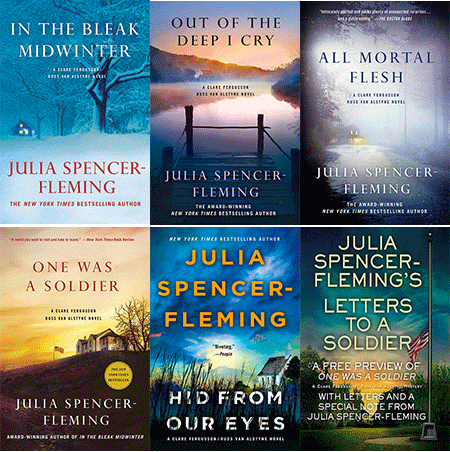
JULIA SPENCER-FLEMING: I’ve been blessed by the cover gods in that none of my published books has had a clunker. After the first book, Minotaur settled on a “vaguely foreboding rural scene” theme which has worked well.
However, when ALL MORTAL FLESH was in the process, someone had the bright idea to rebrand the cover to emphasize the obviously popular romance angle, and I got a couple artists’ concept mock-ups that I refer to as “my vampire covers.” One has the face of a beautiful woman in her twenties, staring toward an off-screen sunset, with a gorgeous guy in his thirties, also in profile, right behind her. This, I understood, was to represent Clare, a 36 year old with a “plain face” “all points and angles”, and Russ, a rugged 50 year old with graying hair and glasses. Huh.
The second one was even worse, if you can imagine it: it took the male model away and had the woman’s face, still in profile, hovering over a very pointy church spire, giving the effect of a giantess about to suffer a horrible injury to her soft palate.
Lucy, I swear, I looked everywhere for these pictures; I think I must have deleted them in horror. The cover they eventually used was based on a sketch I did, after a fairly heated discussion, seated at the St. Martin’s booth at the old BEA (How I miss it! Yes, the Javits Center was awful, but still.)
Question of the day: Reds, tell us about your most unusual (or other adjectives) cover.
Readers tell us about a cover that particularly drew you in or repelled you from reading a possible book.


Lucy, I am still chuckling over the cover as I try to figure out how it relates to a Food Critic mystery!
ReplyDeleteOver the years, there have been a couple of really horrible covers for Richard Matheson's "I Am Legend" . . . good thing I didn't choose the book for the cover but for the author . . . .
we're lucky to have you as a reader Joan!
DeleteI'm scratching my head over your cover, too, Lucy. It's not bad, but it's not you. Maybe that's partially because we are used to your regular covers, which have all been great.
ReplyDeleteTry as we might not to judge a book by its cover, we can't help it.
But it is also interesting to see how cover styles have changed over the years. Deborah's first few were the style of the time, whether they fit the book itself or not. I do like those for certain books, but I can see why authors might not think they fit their particular book.
Yes so true, the style of cover art changes over the years just like fashion!
DeleteLucy, I would buy that book even though I don't like the cover because I love your books but if it was a new to me author I'm not sure that I would. I love a good cover. My son would get me books based on the covers as gifts as he noticed what kind of books I liked to read.
ReplyDeletethanks Paula, and what a good son:)
DeleteDon't even get me started on my covers. Some I like, some I loathe, but my input has been minimal. However, I absolutely love both of my Detective Honeywell Mysteries covers. Julia, when my Honeywell editor asked me about cover styles I especially liked, I named yours. I didn't realize I should be grateful she didn't find your vampire covers and use them as inspiration!
ReplyDeletetoo funny Annette!
DeleteAnnette, I love all your covers. The cover of your first Zoe Chambers, Circle of Influence, is what started me on the series, and the covers have continued to be great.
DeleteREDS: Different publishers and art departments certainly have a different vision for your series books.
ReplyDeleteWOW, LUCY that Harlequin cover does not ooze culinary cozy even if the Highland Coo has scones on its horns! And I have the earlier books from DEBS' series that don't give me any London police procedural vibe. If I was a first time reader of either LUCY OR DEBS' series, I doubt that I would choose to read the book based on your covers.
I do notice the difference between US and UK versions of books. When I look at my bookshelves, many of the UK series have covers in black. And yes, there have been a few times when the publishers has changed the author's name, as was done for HANK/ANNA.
I find the name change baffling. If they look Anna up, they won't find her rich history, right?
DeleteTrue, but I also know many authors have to change names in North America when they either write a new series with a different publisher, or write a book with a different genre (e.g. thriller vs rom-com vs fantasy).
DeleteIt's up to the author to create a website that lists all their books under different names.
YOu know, I didn;t add ANna Ryan anywhere--so many reasons. But when I looked "her" up on goodreads a minute ago, TRUST ME is at the top of the list, followed by
DeleteHomemade Pineapple Recipes: Happiness is When You Have a Homemade Pineapple Cookbook!
by Anna Ryan
Where Land Meets Sea: Coast... Where Land Meets Sea: Coastal Explorations of Landscape, Representation and Spatial Experience
by Anna Ryan
\\
Homemade Broccoli Recipes: A Homemade Broccoli Cookbook that Novice can Cook
by Anna Ryan
I'm just...letting it all go... :-)
HANK: I do understand about Anna Ryan.
DeleteI have seen long-running series by US authors picked up mid-way by UK publishers. The UK publisher starts with the first book they have published & do not mention any of the backlist titles (or the author's alternative US name).
P.S. I looked at my bookshelves a bit more and found several UK authors that have all white covers: Reginald Hill's Dalziel and Pascoe, and Len Deighton's spy novels. But black UK covers still are the dominant colour of the books on my shelves.
DeleteAuthors with multiple names drives me crazy. I wish publishers would stop pushing that already.
DeleteOK, cow lady here. I adore cows, raised them for decades, and am very sad to be currently cowless. Cows are my spirit animal. (I have the personality of a boss cow.) All of this is to say I would definitely pick up that book! The cover gets the cow's tongue right -- since they use their tongues to wrap around grass and rip it off, rather than crop it with teeth like horses and sheep, cows can clean out their ends of their nostrils, just like that. However, since Highland cattle are beef animals and he/she seems to have speared hamburgers leaking blood or ketchup, it may be tactless. Of course no one will notice that but me, I'm sure a closer look would reveal the food to be scones, and I am confident that the Harlequin audience will know this is not a grisly murder with the heroine gored to death by a cow or bull.
ReplyDeleteYes, before the miracles of modern breeding and dehorning, all cattle, males and females, had horns. Remember Borden's Elsie? Most people leave the horns on both sexes of Highlanders, though in a barn the horns become a little bit like 19th century hoop skirts trying to pass through a doorway.
Julia, "horrible injury to her soft palate" made me choke on my coffee. Thanks for the laugh! (Selden)
Agree about what Julia wrote, Selden!
DeleteSo happy to hear from someone whose spirit animal is a cow! this is so enlightening...
DeleteLucy/Roberta... cows like routine. The saying is, do something three times with a cow and she's trained. This is why there are deep cow paths in pastures. "I walked this way once, obviously it was good, why move three feet to the right?" I too like routine -- even ruts. Also, a "boss cow" does not put up with things she does not like. When I would have frisky young bulls or heifers in the barn who didn't respect her space, my boss cow would put her head down, flex her neck, and throw that teenager into a wall. No damage but... instant chastening. What a superpower. :)
DeleteThat animal is disturbing, Lucy!
ReplyDeleteLike you, I get early input but not late veto power. I've loved my cozy covers, minus one. My second Country Store mystery is set in late November but the artwork shows green grass and leaves through the window. By the time I see the covers, it's too late to change. Since then I've been very careful to specify the season!
I did get an exception to the rule last year with the cover for Murder Uncorked, the first Cece Barton mystery. I'd told my editor that Cece drives a red 66 Mustang. During the writing I changed it to blue for several reasons but forgot to tell my editor. Blessedly they changed the cover.
This month I've been working with the artist and book designer for my new historical, and I have all the input I want, including about fonts and typefaces on the cover and inside. I'm actually finding all of it daunting. Fingers crossed!
that sounds hard Edith, to be in charge of everything
DeleteLucy, understand all your reasons for not wanting the highland cow. But I love it! It signaled to me this is a different look at Haley and Miss Gloria, not on the back of a scooter in the warmth of Key West, but on an adventure elsewhere. “What?” says my brain, “This will be an exploration.” (Also, the term “food cozy” really turns me off…I read your books not for the food but for the mystery.) Elisabeth
ReplyDeletevery glad you like it Elisabeth!
DeleteI took one look at your cover photo, Lucy, and thought whoa that is way different than usual! Wonder what happened. Where’s the food? Then I figured out there were scones and jam on the creature’s horns and thought it might be okay after all.
ReplyDeleteI was really attracted to the black cover and orange flowers on Deborah Goodrich Royce’s Reef Road. And did read it. About the same time there was another author with a book with almost the exact same cover. At the time I went so far as to look to see if they had the same publisher. Perhaps the art dept really liked it too! They were not the same. This morning I cannot put my finger on the title or author of the other book which I have yet to read. I watched several online interviews with each of the authors and no one ever brought up the twin covers.
Brenda, I think a lot of art departments must use similar images from a bank of images. We know that if one book sells well, others follow that same trend. For better or worse...
DeleteThe other book with the cover similar to Reef Road (Jan 2023) is Someone Else’s Life by Lyn Liao Butler (Feb 2023) both thrillers.
DeleteLucy, like Hank, my first reaction was "What does a buffalo have to do with a foodie cozy?" Your explanation makes sense, but still scratching my head.
ReplyDeleteI've been relatively fortunate with my covers. My historical is the same "retro" image with different colors. The Laurel Highlands are all images that are pretty close to reality. I do get input. Now if only I could get them to recover the paperback of THE ENEMY WE DON'T KNOW to look like the rest of the series (that one is probably my least favorite - I know what they were going for, but the plane is not a P-39 and, well, they tried).
Liz, probably no one looks as carefully at covers as we do!
DeleteI would say that Debs' cover wins for worst cover actually used by the publisher. Had I not found her first book in a library (where I didn't have to purchase it), I doubt I would have chosen it. There are definitely books I walk on by, based on the covers. I don't like cartoon-like figures on the cover. Covers I loved from the get-go were those on Tony Hillerman's books, also Anne Perry's William Monk series--they were wonderfully representative of the stories being told. However, I would read Lucy's Highland Coo book because of her name--if I already know an author, I only care about getting my nose into that first page.
ReplyDeleteWell thanks Flora!
DeleteThanks, Flora! I think, LOL!
DeleteDebs, you are high on my list of books I can't do without!! I know authors don't often have much to say about covers--especially when they're getting a series going. Someone posted your first cover on Facebook today--it is charming, as you say, but certainly gives off a 1920s vibe!
DeleteChanging Hank to Anna falls under the category of things I will never understand about the publishing industry. Along with having a picture of a cow licking its own nostril on a cozy mystery cover. Hunh? How is that meant to be appealing? Good thing so many read ebooks these days. The cover is much less important, at least to me.
ReplyDeleteMaybe it's because when I was a kid full-color covers on hardbacks were not the thing, unless you got a dust cover with it. Most books had plain covers with nothing but the author, title, and the publisher's name on the spine. Today's cover art does mainly one thing for me: it sets the overall tone of the book/genre. For instance, if I see a toothy smile with blood dripping from it, I know the genre is most likely not for me. Same with covers with wild symbols in dark colors. And honestly, I'm really over gratuitous cats on cozy covers. I'm allergic, and they universally hate me. Take pity. (I just try not to look. Kidding. Maybe.) A Heeghland coo with scones on its horns is a refreshing change from cats, at least. And probably makes as much sense, to be honest. Just another, albeit bigger, mischievous critter!
LOL Karen, maybe I should have one of these creatures on every cover!
DeleteLucy, I immediately liked the Highland cow, and personally would be drawn to the book, just because I love Scotland. My first thought was that it was blood dripping off the horns; then I took a closer look and realized it was jam.
ReplyDeleteJulia, your description of giantess Clare and the church spire totally cracked me up!
I think title, setting, author and blurb all mean more to me than the cover art when I decide on a book.
That's good news then, maybe they are on the right track!
DeleteIt is interesting that since I predominantly read audiobooks or ebooks, that I generally do not see or think about the cover. I do see flashes of covers as they flip by in my peripheral vision for books coming out, but generally don’t think anything of them unless they are by an author who I particularly follow.
ReplyDeleteAll that being said, if I was to see any of the covers for the Louise Penny books, I would not pick them up to see what they were about. They do not grab my attention, but rather turn me off looking to them. Cozy mysteries – I like them a bit ‘fluffy’ with nice colours, possibly a cat or dog, or maybe a row to hoe. I notice that a lot seem to be colour coordinated by which I mean there is a predominant colour for that author or the particular set of books. Kate Carlisle’s bibliophile books are browns, Jenn’s cupcakes are pinks, Vicki Delaney’s Christmas books include red, and her Tea by the Sea have pink and teal – makes you want a cuppa and a cucumber sandwich.
As for the highland bovine – well I do love cows, but that is a nasty looking beast even tho in real life they are a lovely creature. As for the scones – they look more like donuts that were made in a ring but jelly-filled – now that would be a baking challenge. It would make me want to play the (new) game ‘Fling the donut on the bovine’. Definitely would not entice me to read that book!
chuckling over fling the donut on the bovine!!
DeleteI love covers that have a lot going on that allows you to stop and take everything in and imagine what the book will include. When I see the Scone of Contention cover Lucy I think this is about a cow or bull that raids a picnic (maybe) and gores the scones and everyone is in contention now with the wild animals that roam the highlands!!!!! LOL
ReplyDeleteMe again from above. Actually I like that it a picture of the highlands - brings you right to Scotland. I am starting to like the cow!
DeleteI'm starting to feel fond of the coo also, and I especially love Rhys's large sheep!
DeleteI always remember the first Janet Evanovich cover I picked up, which is much like the Joanna Fluke covers - very plain but colorful with a lipstick or handcuffs on it. I knew I was getting a mystery and that it would be a wild ride. Those are the best sorts of covers - the ones that let you know exactly what you're buying, I think.
ReplyDeleteGood point, Jenn. Somewhere we have the original paperback of One for the Money, and all it has on the cover is the title and author's name, etc. My youngest daughter gave it to me for Christmas when she was in first or second grade (Daddy took them to buy gifts). Who knows what drew her to it, with no pictures.
DeleteThat's the most important job of the cover--to tell the reader what they're getting and draw them in.
DeleteDiana here: I remember an illustration of a big blue car on the cover of either One for the Money or another mystery in the series, Jenn.
DeleteKaren in Ohio, what color was the cover of the book that your daughter picked ?
Lucy, the book cover can draw you in.
I think it was black, Diana, or some dark color. That was definitely not the draw. It's possible a bookstore clerk steered her to it.
DeleteDiana here. It sounds like the bookstore clerk recommended the book. I have seen notes on books in bookstores with mini reviews by bookstore clerks stating why they loved this book.
DeleteLucy, I missed the scones impaled upon the horns entirely but the coo does look contentious. i look at the covers but sometimes only for a laugh, then I go for the authors I know, no matter the cover.
ReplyDeleteNext book: A Contentious Coo by Lucy Burdette
DeleteYes!;-) Elisabeth
DeletePERFECT!
DeleteI so enjoyed all the Jungle Reds’ comments! And chuckled too. A cover I found off-putting was Lessons in Chemistry- ugh. The book by Bonnie Garmus was one of my favorite reads for 2023. “Six-thirty” will never mean the time to me again *wink*
ReplyDeleteMust learn how to post with a name here. Oh well.
DeleteAnon. If you can figure out Blogger’s name skipping, Jungle Reds and commenters will present you with a medal! Blogger used to let me have a name…but one day, sigh, no more. Elisabeth
DeleteType your name in the first screen. It is offered as an option.
DeleteThanks, Anon. Been there done that several times and Anon I remain. Elisabeth
DeleteI think it's interesting that different covers are used for different countries. I always wondered about that. Louise Penny has some really nice covers. I always go by a known author I like or by the description of the book, not the cover art, but I am sure it is frustrating to an author when their baby has a cover they don't like!
ReplyDeleteYes!
DeleteMy covers for Wild Rose Press have utilized my input, and I have been able to select my cover artist, the very talented Debbie Taylor. I'm wild about them.
ReplyDeleteHow wonderful!
DeleteI too go for authors I know and pay more attention to the title than cover art. What I did not know was that scones and jam are part of a highland cow's diet. Tea too?
ReplyDeleteSee, this is news to me too! it would have to include tea...
DeleteJust waking up, not really functioning, so at first glance I saw a title and a bovine Honestly, all I really saw was the cow. Who is writing a book featuring a cow? Recognized the title but that cow. There is a really cute sheep, I think it is in the highlands of Scotland. Kind of reminds me of an English sheepdog. But, alas, I don't remember if they have horns to get into the baked goods.
ReplyDeleteLOL
DeleteDiana here:
ReplyDeleteLUCY: that is a different cover of A SCONE OF CONTENTION from the copy that I have ans I LOVE the book cover that I have with a Scottish plaid, food and cute cats.
DEBORAH: Even though that picture on the cover is not what you wanted, I loved that I can SEE the title because the color yellow on the blue/green background makes it easier to see. I love your books and I am sorry to say that the recent book covers are really difficult for me to see the TITLES because the color of the title letters BLENDS into the background colors.
RHYS: I love the covers of the Constable Evans mysteries. They reminded me of my visit to Wales - it surprised me to see how Green it was in Wales. To my surprise, I did not see any coal mines. We were in the Wye Valley, just across the border from England.
JULIA: It looks like you had some say in the book covers because when I saw the cover, I was reminded of that line “it was a dark and stormy night”. Was that the vibe that you were trying to convey? Did you want a different cover from the cover I saw?
JENN: Love the book covers. In the first Connecticut library book, I saw a cute dog on the cover so while reading, I was looking for that dog in the story.
HANK: Did you want a photo of what the protagonist looks like on the cover of your books? Why on earth would they not want your name on the cover? If they could publish books with names like JK Rowling, then why not? There are some English writers with names like Evelyn Waugh, who was a Man, though some people thought Evelyn Waugh was a woman. Mary Ann Evan’s wrote her name under George Sands.
HALLIE: For a book about writing, I would think they would want a photo or illustration of a pencil? A typewriter? Writing instruments on the cover, not a cover that looks like it is a suspense novel, right?
This comment has been removed by the author.
DeleteI know! That's what I told them... and the cover I ended up with is magnificent. Someone... YES AT A TYPEWRITER! In shades of orange and black.
DeleteThing is, as far as I can imagine, the woman on the cover is NOT the protagonist. And. the name decision, truly, I have no explanation for it. Nor does my agent. It's just--what they wanted. All good. :-)
DeleteAs long as they spell your name right on your checks, Hank!
DeleteHA! YOu are SO right! xxx
DeleteDiana here: there was one book cover that turned me off. I received it as a gift years ago. It had a picture of a young person’s face that repelled me. It was the facial expression. As far as I know it was literary fiction written by a well liked author. I have liked other novels by that author.
ReplyDeleteOne example of a UK publisher using the same book cover design for all their authors are PENGUIN Crime Club books. I have dozens of books from several authors such as R. Austin Freeman, Georges Simenon (Maigret).The book covers all have the same (iconic) green (and white) design. Only the book title and author name changes.
ReplyDeletethat is so interesting Grace!
DeleteThis comment has been removed by the author.
DeleteMy big question about the alternative cover is why the gored scones are bleeding. Or is that supposed to be strawberry jam? I tend to like simple covers, not busy ones, but I'm open to all styles!
ReplyDeleteLucy, that's one fierce cow! It brought to mind the OUTLANDER book in which they drove the cattle into the prison and trampled villains, and made it clear how scary that could be. Reading mostly on the Kindle these days, I have to deliberately look for the covers . . . and can no longer figure out what others are reading just by looking -- good or bad? Privacy for the reader, but missing the "oh, I LOVED that book" connections. -- Storyteller Mary
ReplyDeleteRecently, because I read so much more than I ever did before the pandemic, I have begun to eliminate books because of covers. I do that more with cozies and with romances than with other genres. With romances, I'm with Karen, no bloody teeth, please. I am limiting starting new-to-me cozy series because there can be lots of books to catch up on, and I already have many cozy series that I follow. I want to read other genres besides cozies although I have recently begun a new-to-me series that sounded too good to pass up, nothing to do with the cover. If a book's cover (with the author unknown to me) looks interesting, then I will look up the subject/plot before I will put it into my Kindle or my audiobook collection, or even reserve it at the library.
ReplyDeleteI do love the reliable, identifiable covers of some series, like Rhys's Royal Spyness and James Benn's Billy Boyle WWII mysteries.
Sitting at my desk, I am looking at a shelf in the bookcase full of Debs' and Jim Benn's entire series of books. That shelf is mostly even on Jim's side, but on Debs' side, the books are unidentifiable as coming from the same author. I should take a picture. It doesn't matter, Debs! I would read your books if they were wrapped in brown paper bags, the contents are so very good.
Roberta, I really like your most recent hardcover covers. They don't exactly reflect the stories but still, they do give a Key West vibe. I think it must be very frustrating to know that the art department creating a cover, has no particular interest in what your book is really about. The Heilan coo is a perfect example of that attitude of distain for the contents. I think that publishers should be tougher on their cover creators then they are.
Aw, Judy, thank you!! Fortunately, Harper has updated the covers on all the books for the ebook/audio book market, so there is at least some consistency in the books they have the rights to. But the three Random House books still have the original cover art even for the digital versions.
DeleteI am very happy with those covers Judy! If the publisher has a good idea of what would sell, I'll follow along. this one though just cracks me up. See how mileage we're getting from it?
DeleteLucy, that "coo" is hilarious. Is the expression meant to go with "contention" - he looks more than a little grouchy. Maybe not telling the browsing reader what you want them to know about the book? :-) Covers aren't a small subject. I spent years in libraries watching patrons pick books and learned that cover do matter. I knew an editor (mass market paperback, cozies) who said upfront, being able to do an enticing cover was one factor in accepting a book. And I've known a few who have no clue at all that covers are an important marketing tool. My Poisoned Pen mysteries were published in mass market by Harlequin and I must say, they did a good job of telling the reader what kind of books these were. And I did have the painful experience, with another book, of knowing the perfect photo was out there from a newspaper...and the publisher was not paying to use it and was not paying to have it adapted into an illustration either. Sigh. Wishing all of you writers here better luck (Love the Lady Georgies covers, Rhys!
ReplyDeleteInteresting Triss, that you saw the effects of covers on choice, out in the field!
DeleteLucy, I think you should frame your "coo" cover. It makes me smile every time I look at it. Rhys, I adore your Evans covers--they are utterly charming!!
ReplyDeletethey make a great matched set. I can see them in the guest room:)
DeleteI see that Highland coo licking his chops and think "Ferdinand the Bull." But how is he going to get those jammy treats off his horns? Is that the mystery? Perhaps he is going to present them to his lady love.
ReplyDeleteNever even thought of that Pat!
DeleteFun fact: This 2023 article states that Penguin UK is going to revive their classic 1940-60s green crime fiction book covers.
ReplyDeletehttps://www.telegraph.co.uk/books/news/penguin-classics-return-green-covers-crime-fiction/
https://www.creativereview.co.uk/penguin-crime-espionage-cover-design/
Somehow I lost my comments. A quick second try. I love covers, and some books I have to have more than one copy of the book because of different covers. I know I have three or four copies of The Canterbury Tales with different covers. I often buy the UK and U.S. editions of certain books or authors because of the different covers, like Elly Griffiths and S.J. Bennett.
ReplyDeleteThe Reds are wonderfully consistent with great covers. And, Lucy, I even like the Highland coo, because I love pictures of Highland coos.
I seldom choose a book because of the cover; I usually choose because of the author. But in this case, Lucy, even if I didn't know it was one of yours, I would have chosen it for the cover alone! I love it!
ReplyDeleteI checked which versions of Deb’s early books I have, and they are the Avon covers, black with a ripped out strip that shows a picture. Moodier than the one above.
ReplyDeletePoor Lucy! A friend has a herd of these Scottish cattle here in Taunton, MA. They seem to repeatedly escape his farm and end up on the runway of our local airport. Our farmer friend asked if the airport wanted to rent his cows to keep the grass trimmed. The airport replied that they did not want the liability of an airplane and a cow getting together! ************This changing the cover for a book released years ago has been a real wakeup call for me as I now check the original publication date of everything that I consider purchasing to avoid duplications! I don't often choose a book based on the cover, but rely on my spreadsheet list of what I might purchase!
ReplyDeleteI'm amazed no one has cited Harlan Coben's infamous "bleeding balls" covers - for his first two published mysteries, yet, in his series about Myron Bolitar, a sports agent. Please Google them - it's reassuring to know that if his career could survive those two clunkers, bad covers won't vanquish good authors!
ReplyDelete