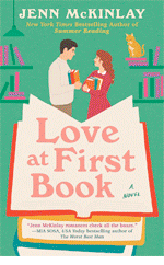
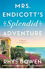
RHYS BOWEN: Since we're celebrating Hank's new book this week, I've been thinking how powerful I find her covers. Just right for her subject matter. Eye catching. I'd buy the book without knowing anything Hank or the subject.
But
You can’t judge a book by its cover. Or can you?
But
You can’t judge a book by its cover. Or can you?
I’m always interested in how
important a cover is in selling the book. Some covers are wonderfully apt and
evocative. My favorite of Hank’s covers so far is The Other Woman with
that one red coat making such a bold statement.

Actually
a cover can make or break a book. If it’s too cozy for a dark subject, or too
bleak for a cozy it will not attract the right readers and turn off those who
bought it. I remember a friend who wrote fast paced legal thrillers was
horrified to find a spaniel on her cover—for the simple reason that the art
director had a spaniel herself. No, it wasn’t a doggy book in any way.
Of
course we all know that animals on covers sell books. Cat especially. Write a
book on Jack the Ripper and have a couple of cute felines in the back streets
of London and the book will sell.
I experienced this myself when I was writing the Constable Evans mysteries. The paperback covers all had sheep/goats/sheepdogs on them, prominently front and center. Even though my stories hardly ever mentioned sheep and never goats. I once told an audience that I had been awarded the Old MacDonald Award. When they clapped I said it was for most farm animals on covers!

It’s interesting what aspects of a cover really do sell books. My Molly Murphy mystery The Family Way outsold its predecessors by a lot. And my agent’s comment was that it had a pregnant Molly on the cover. Apparently pregnant women sell books. Who knew?

I experienced this myself when I was writing the Constable Evans mysteries. The paperback covers all had sheep/goats/sheepdogs on them, prominently front and center. Even though my stories hardly ever mentioned sheep and never goats. I once told an audience that I had been awarded the Old MacDonald Award. When they clapped I said it was for most farm animals on covers!
It’s interesting what aspects of a cover really do sell books. My Molly Murphy mystery The Family Way outsold its predecessors by a lot. And my agent’s comment was that it had a pregnant Molly on the cover. Apparently pregnant women sell books. Who knew?
It’s
very gratifying for a writer when their covers turn into a brand. Look at
Debs’s books. Only a hint of background but the name and title taking up the
whole cover. This says clearly, “We don’t need to hook you with a cat or a
pregnant woman. We know the hook will be Deborah Crombie’s name.”

I’ve
been pleased with both sets of covers. The Royal Spyness books are fun, playful
and easily identifiable as a book in the series. My most recent Molly books
have had gorgeous covers—soft colors, heroine at the front, and an evocative
scene behind her.

Recently my agent has commented that “Molly” covers seem to be popping up all over the place. I don't know if I can claim that my books started a trend. Perhaps this kind of cover is in the air at the moment. Perhaps it's found to be what works for historical novels. Or maybe other publishers use the same artist, but there are distinct similarities, don’t you think?

Recently my agent has commented that “Molly” covers seem to be popping up all over the place. I don't know if I can claim that my books started a trend. Perhaps this kind of cover is in the air at the moment. Perhaps it's found to be what works for historical novels. Or maybe other publishers use the same artist, but there are distinct similarities, don’t you think?

And Reds and writers—how much input do you have into your covers? Are you happy with them? Wish they were different?


.jpg)
Generally, I have to say that I don't look at covers when I am book-shopping. I look for the author's name.
ReplyDeleteIf I pick up a book by an author I have not read before, it's generally because the title captured my attention rather than the cover illustration.
Having said all that, I do like looking at the book covers although I am not a fan of really dark, creepy, foreboding artwork.
I agree with your comments about "The Other Woman" . . . I love the Molly covers [imitation is flattery???] . . . I have always been intrigued by Julia's covers . . . .
Covers do catch my eye, especially when I am just browsing and come across a book I recognize by its cover as one by an author I like. If the cover is too dark or busy or the title just seems weird I will probably pass it by, and may have missed some great books that way.
ReplyDeleteGrandma, you stated my sentiments exactly. Maybe our generation...Nana
DeleteAgreed - the Reds have great covers! Covers certainly catch my eye. Especially when I'm in the library looking for cozy mysteries, they're easy to spot.
ReplyDeleteSpeaking of cozies: despite my editor asking for my cover ideas every time, they ignored my suggestions completely and it took three books to get one that actually looks like a cozy mystery. Wish I could paste in the cover to FARMED AND DANGEROUS here, but you'll have to wait until May to see it. I even got Preston, the Norewegian Forest Cat on it, at long last! He's in the farmhouse kitchen staring out at the snow. Its perfect.
LOL on the Old MacDonald award Rhys--hysterical about the sheep and goats:). And you've nailed it on Debs' and Hank's covers, and Hallie has a fantastic cover in March.
ReplyDeleteI feel very lucky about my Key West covers--the artists are amazing and the colors truly pop. And my editor is very good about taking suggestions (sorry it took 3 books for you Edith!)
For FATAL RESERVATIONS, which I'm (supposedly) writing now, I really wanted a cat leaping through a flaming hoop at the Sunset Celebration on Mallory Square. My editor said we'd hear from every animal rights person in the world--and not in a good way! So idea nixed.
Thank you Rhys! I love my new cover-it's sophisticated and chic..and my name is in metallic gold,so it shimmers.
ReplyDeleteThank you to all--more than a hundred people! at the launch last night! whoo.
And soon I will post the prizes from yesterday! Thank you ALL!
Must give a shout-out to the man who does the cover art for the Maggie Hope books — Mick Wiggins. He does art for the New Yorker as well as other book covers. His web site is here: http://www.mickwiggins.com
ReplyDeleteCovers make a little difference to me; usually, they help me identify which genre the book is most likely to be. Cozy-ish book covers, like those on Roberta's and Rhys's books, are very different from Hank's, Julia's, and Debs'. (This was an editorial exercise in possessive apostrophes.) Covers offer a clue, but beyond that I don't pay all that much attention to them, unless they are particularly striking.
ReplyDeleteRemember Jonathan Franzen's last book, the one with the blue-ish bird on the cover? My brother-in-law sold that bird photo to the publisher, and he's been paid several times for it, as they've published different editions. That cover was distinctive, even though the book was just so-so.
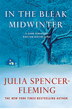
I just got Debs' book last night, but didn't realize until I looked at the graphic here on the blog that a picture of the London Eye is behind the text! Intriguing.
Susan, I meant to add that your covers are lovely, too, very fitting for the era the books take place in.
ReplyDeleteI do get input to my covers and I LOVE the one for NIGHT NIGHT, SLEEP TIGHT. It sent me off to Etsy to score pink pearls. So far: a lovely three-strand bracelet. Because the only thing more fun than book covers is deciding what you're going to wear for the launch. MARCH! Go to hallieephron.com to see the new cover.
ReplyDeleteThank you, Karen!
ReplyDeleteI look for the names of my favorite authors. Sometimes I've ended up deciding to choose something by an author who is new to me simply because his/her name is alphabetically near books by one of my favorites. You can't imagine how many authors I have come to love by making my choice this way!
ReplyDeleteIf a cover intrigues me, I may end up looking through the book to see if the story holds up.
I DO love the covers on the books by the Reds, by the way!
I pay attention to the covers because in many ways, I'm a visual person. If a cover is well-done, I'm more likely to pick up a book and check out the jacket copy. Even for authors I know well and love to read, a great jacket is an added fillip of pleasure.
ReplyDeleteJulia, I recall, posted different versions of her last cover, asking her readers what they thought--which best conveyed the mood of the book. Louise Penny reveals her cover slowly to her readers.
I do pay attention to covers. Like others, they give me a sense of what the book is genre-wise (thriller, cozy, etc). If I see a particularly striking cover, I'll often pick up the book to read the jacket copy or the first chapter. I don't think a cover has ever made me buy a book, but it's definitely gotten me to pick one up.
ReplyDeleteI think all the JRW covers are great for their authors, and I adore Hank's covers. Hallie, I think the pearls are stupendous.
Edith, sorry you had problems. I'm sure that, as an author, it's a little disappointing when the cover doesn't live up to your expectations. But I do hope I'll have the same problem some day. =)
What Joan and Karen said. I don't look at covers (unless it is to be repelled by them). I do look at intriguing titles, and I look at bookstore recommendations, and I bear in mind reviews I may have read.
ReplyDeleteI hate to say this, but I rarely remember the names of authors or the titles of books unless they are major works or the works of my friends. This sometimes means I am partway through a book before I figure out I've already read it.
But I have always bought books based on the classic sequence described by book designers/publicists/publishers:
1. Look at title and author and decide it looks interesting or that I've heard about it and meant to look at it.
2. Look at the back cover to see what the book is about and learn something about the author.
3. If it is a hardcover, read the flaps. If it is a paperback, read any information/blurbs/summaries just inside the covers.
4. If I'm STILL interested at that point, I read the first page. If the prose is murky or pretentious or dumb, I put the book back.
5. If I like the first page, I open the book randomly to some other page and read that. If the style holds up, I may well buy the book-- unless it is overpriced, in which case I wait for a half-price sale and probably never do pick it up.
I'm even worse when I have actually purchased a book, because if I don't read it immediately, I tend to put it into the infamous TBR stack from which it may never emerge ("The Name of the Rose" is still in that stack-- that'll tell you how far behind I am.)
I love all the Reds covers! Classy and cool. Each speaking, I think, loudly to what's between the pages.
ReplyDeleteThe first thing I look for while browsing bookshelves is the name of favorite authors.
But because I read such a mash-up of genres, I do find myself attracted to cover art.
I probably bought "Night Circus" because I was so smitten with the cover.
And I am really wild about the Phryne Fisher covers which remind me of old Vogue Magazine cover art.
Unfortunately, I have run across the same cover art on more than one book. That, I think. must be a bit hurtful to the authors of both books that's happened to.
There does seem to be trends for cover art just like for this year's clothing or shoes, and it has to do with "branding," I guess. An observant shopper can now tell a lot about a book by its cover, I think.
I am definitely influenced by book covers if I don't already know the author or series yet. And, like Kaye, I'm a sucker for the vintage/art deco kinds of designs, like the Phryne Fisher books. Or the Conrad Allen series (aka, Edward Marston, GoH at Bouchercon!) which are all set in the 1900s on ocean liners.
ReplyDeleteAs for input, I've been really lucky with Poisoned Pen Press and my covers. I've made a gentle stink with every cover, insisting that they can NOT (not not not) have street cars on them, when they concern racecars. So far, they've listened and changed things, at least enough to salvage my credibility.
My biggest triumph was for the recent book (Avoidable Contact), when I was able to send the cover artist photos I'd taken from the correct track and race featured in the book, and he created a gorgeous on-point montage for the cover. Hooray! I feel like that never happens to authors, so I'm very grateful.
Deb Romano, that is too funny! I found Rhys because her books are right near C.J. Box on the library shelves. And now I'm much more a fan of Rhys than C.J. His books have become very dark. I always peruse the "new books" shelves in the library and frequently pick up a book because of the cover. Sometimes it works out, sometimes not.
ReplyDeleteI absolutely love the Molly and Georgie covers, Rhys! They're evocative of the contents. And, Susan, the Maggie Hope covers are terrific.
Covers can catch my eye and make me interested in picking up the book. However, the subject matter of the book needs to interest me to get me to read it. Or the authors name. There are some authors I will buy no matter what they write about and enjoy it.
ReplyDeleteBut the idea that a cover needs to capture the tone of the book is very true. Different types of books have a brand of covers (for better or worse), and I have some idea what to expect when I start reading a book with a certain kind of cover. If it didn't have that, I'd be very upset.
What I like about the Molly covers is that you can see her face and that she seems to be doing something (looking back or heading somewhere), not staring pensively into space. I am a bit tired of generic stylized 'historical woman' covers.
ReplyDeleteI like bold covers and am drawn in by a good font, especially when I am browsing along the spines at the library.
Let me first say that I am an ardent fan of book covers or cover art. I have a category in Goodreads for "great covers." I am fascinated by all manner of covers, from children's books to adult, mainly fiction, and from vintage to contemporary. Penguin Books is a publisher that clearly speaks to my cover-loving heart with their variety and creative cover endeavors for classic books. Most recently, I bought two graphic novel covers (not graphic covers (not graphic inside), one for Frankenstein and one for We Have Always Lived in the Castle. In those covers, I already have Ethan Frome and The Acts of King Arthur and His Noble Knights. (http://www.penguin.com/static/pages/classics/graphicclassics.php) I have Emma and The Secret Garden in Penguin Threads (http://www.penguin.com/static/pages/classics/penguinthreads.php). There are other Penguin classics that I have and plan to buy, too. I buy these for their covers, as most of the books are already on my shelves in less catchy covers.
ReplyDeleteHaving praised Penguin, I need to praise the Jungle Reds' covers, too, because your books do indeed have great covers.
Hallie, the cover for your new book coming out in March is spectacular. The pink pearls are exquisite. All of your covers are deliciously mysterious, promising that there is much to beware of beyond the shadows, kind of a hold-your-breath anticipation.
Hank, your covers portray that titillating hint of mystery and thriller with a beautiful color balance. I'm a fan of the red coats in 1 and 3, too. I think the woman on the covers definitely speaks to your style and elegance, too.
Debs, both the clearer pictures in the first eight books and the more background pictures in the last eight have intrigued me and given those wonderful glimpses of an England and London I long to see. Oh, and what a treat and work of art the inside cover maps by Laura Hartman Maestro are.
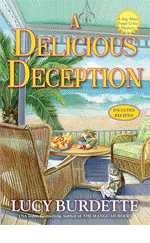
Lucy, as soon as I look at a cover for a Haley Snow book, I know it's going to be fun with a twist of quirky in a place that celebrates both. Your covers perfectly capture the essence of Key West, and I'm wondering if you shouldn't get some kick-back from the Key West Chamber of Commerce.
Julia, I immediately become ensconced in the world of the Adirondacks when I see your covers, wanting to step into the picture and meet Clare and Russ walking down the street or working their way through the drifting snow (I'm partial to the snow covers).
Rhys, you have managed to have two sets of fabulous covers in Georgie's and Molly's books, one fun and lively and the other a bit more pensive and transitional. And, yes, I have noticed some similarities in some other covers compared to yours. And, might I add that I love your Old MacDonald covers for Constable Evans. I've got the first one on my table here, and I am such a fan of goats that it absolutely delights me.
Susan, your covers perfectly convey the flavor of the time period for the Maggie Hope series, and they give that non-verbal hint of the direction of each particular book so smoothly.
Now, as much as I love covers, I seldom rely on them for my reading choices. I have way too many favorite authors and authors I'm trying to get to for a cover to be the deciding factor. I know that every single book I read from the Jungle Reds will be a stunner, with or without the accompanying great covers. Of course, I'm not above buying a book just for the cover to add to my collection of interesting covers. Heck, I even have books about the covers on books. Hahaha!
Hi Rhys, there's something iconic about the Molly hat -- it really does convey a time and also a female type from that era. I can see why your covers are getting copied. (I'll imagine that's the truth.)
ReplyDeleteI'm just going to call it the Molly hat from now on!
Covers definitely catch my eye. I'm with everyone else -- the JRWs covers are all perfect for their brands.
I'm very drawn by covers! In fact I start with the cover then look at the name, do a quick read inside. If I'm not hooked by then I move on! That's how I found Rhys! A Molly Murphy, danny boy!
ReplyDeleteDefinitely! I am usually not a sci-fi/fantasy reader (I was years ago) but bought a book, "Soulless" by Gail Carriger simply because I thought the cover was wonderful. Led me to read the entire series.
ReplyDeleteI have to say that when I do read specific authors the covers are not what influences me to buy the book because I already know I want to read it.
Nitpicky point: it really bothers me when a cover either has nothing to do with the book or there are glaring discrepancies between something described in the book and the depiction on the cover. If the cat is described as a white long-hair and the cover shows a sleek black cat (just an example) it irks me that the cover artist didn't bother to follow "instructions", if you will.
Hi Karen in Ohio! So lovely to meet you last night in Dayton. Wish we'd thought to get a pic!
ReplyDeleteAnd the London Eye has absolutely NOTHING to do with my cover, by the way... Usually I have cover consultation but no one even talked to me about this one--they just sent it to me! That said, it's very eye-catching, and I don't really object.
My favorite covers where the Morrow books from Now May You Weep through Necessary as Blood. They used my own photos, though usually tarted up a bit by the art department. Then with No Mark Upon Her Morrow decided they wanted to go with a "big book" type cover. I can't complain, as they have done so well, but to me they're not as visually appealing.
I love all the REDS' covers--they convey the spirit of the book so well. I'm very visual so am influenced by covers. Interesting, as I've been doing a lot of bookstore browsing while on tour. The books I'm most likely to pull of shelves if I don't already know the author are usually sort of literary historicals. I like covers that tell a story.
Okay, I apparently lied when I said you couldn't see my cover until May. It's up! (I never get notice when things like this happen...) http://www.amazon.com/Farmed-Dangerous-Local-Foods-Mystery/dp/0758284675/
ReplyDeleteI love beautiful cover art like yours, Rhys. All the Reds' covers are distinctive. Period drawings and graphics reflecting place or condition are all important. And Deb's, as you discuss, are sold with her name. Yet her name and the graphics are very distinctive and striking. No ugly covers.
ReplyDeleteCovers help me spot authors I like, clue me into a time period I might be reading about, help me tell if there are 'soft edges' (kindly people or places), 'shattered, sharp edges' (broken people, lots of explosions/chase scenes), etc. Generally get me to pick up the book to read the back cover, a few pages.
ReplyDeleteHaving just added two books on this thread to my "Must Read" list, I'd say that covers are extremely important even if I had not thought as much to begin with. Also, I consider a few negative comments on my own book covers as helpful as the positives. Different reactions to the same image mean that the cover did its job. A potential reader who considered an anime couple too erotic/offensive would not enjoy a multicultural story which includes an interracial couple, a gay couple, class and race themes, etc. I'd rather a person not buy the book than complain that the cover lured her in via gross misrepresentation of the book's contents.
ReplyDeleteThe name of an author I've read before and enjoyed is a bigger draw for me than a cover.
ReplyDeleteThat said, I have bought books because of the cover ( the hard cover edition of Annie Dillard's For the Time Being), or the end papers (like Debs' maps or Kate Morton's US editions) or the way the theme of the cover (as in The Night Circus)is carried through the volume creating something I can't resist owning.
I think the covers of cozy mysteries are usually the ones that best represent the content, and there are some very good ones. They have tempted me to try an unknown-to-me author. I always come home from my mystery book shop with a book or two that wasn't on my list.
I've been very lucky with my covers. Eye-catching, fun, and a little bit nutty (one on ghosts, one zombie tarot deck, one on haunted stuff with a one-eyed doll, and a Boxcar Children book), the art departments have outdone themselves. When I go shopping for books, I gravitate to those that have darker colors though not overly dramatic, and then the author. I'm a marketing team's dream-reader. ;)
ReplyDeleteGreat post!
Yep, I'm a cover girl. The cover is the first thing that catches my eye about a book followed by the blurb. If those two things pass muster, then it's onto the first few paragraphs. If those grab, a sale is made.
ReplyDeleteIt's funny, Stacey. Being a wimp I gravitate away from darker colors and stark designs on covers. I like something evocative, especially one that gives a spirit of place.
ReplyDeleteIf I don't know the author, then the cover definitely helps. I am also attracted to a book by it's cover, too. I do always read the back or inside cover to see if I'll like it, so it's not 100% the deciding factor. I do like the many retro covers that are popping up, with the help of Molly. I am also intrigued by book titles and have been known to pick up a book with a fun or interesting title.
ReplyDeleteIf I'm looking for a new author, the cover matters. I wonder how much cover design had changed in the era of thumbnails and web shopping?
ReplyDeleteYes a book cover influences me to take a second look or not. All of the book covers you posted draw the reader in for further inspection.
ReplyDeleteHank here! AND THE WINNERS (from yesterday) ARE:
ReplyDeleteShelly from Muncie
Mary C from Chestnut HIll
and Grandma Cootiie
YOU WIN a gorgeous black satin drawstring bag embossed with the words "Who is The Other Woman?"
Slinky and fabulous..and perfect for holding beautiful things. And there are only a few of them in the world.
Email me at h ryan at whdh dot com
Congrats to the winners! Cool prize Hank! (:
ReplyDeleteThe Berkley Prime Crime covers are great and I love to look at them. One cover that got me interested in a book was Chocolate Chip Cookie Murder by Joanne Fluke. That was the first in the series and I hadn't heard of it before seeing the book. The cover featured a bear cookie jar with its mouth open (shocked by the murder?) and surrounded by cookies. I remember buying the book at Barnes and Noble. The cover really drew me in, I thought it was cute, and after reading the back of the book and looking through it, I knew I had to buy it.
ReplyDeleteCovers catch my eye if I am browsing. If it's a book by a well known author they are a bit optional - nice if well-made, but they wouldn't keep me from buying the book if they are not :-). And with reading a lot of ebooks, they are becoming less important.
ReplyDeleteOne thing however - I read mostly in English (though living in Germany), but when I spot one of the German translations of Deborah Crombie's books, the covers Goldmann sticks on the books make me spit! They tend to use stock pictures of rural cottages which have absolutely no relationship to the content...