LUCY BURDETTE: The seventh Key West foodie mystery, Killer Takeout, will be on bookshelves soon (April 5.) Last month, that seemed a long distance away, but now the time will rush by. I have blogs to write, and proposals for new books to create, and recipes to develop, and the Key West Friends of the Library newsletter to produce. In other words, I am all over the place with what I'm writing. If I started to list it all, I fear I'd spin off into a great big ball of anxiety.


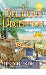
Here's the second draft, minus stop sign and with reduced blacktop...and with the addition of some kind of bead shop, who knew? And notice that the truck's name has changed to Beach Eats (suggested by Celia Warren Fowler.)
Back to the drawing board for more blacktop reduction. (I'm not kidding!)

 And here's the "final" draft--but purple? Oh no, I had been lobbying for orange. Because the purple seemed too close to the blue of FATAL RESERVATIONS. We certainly didn't want readers getting mixed up and thinking they already bought the new book!
 Was I wrong? I didn't think so. Was I displacing all kinds of other writer worries onto this cover? Absolutely!
Meanwhile, my editor had taken to Googling Fantesy Fest. And she'd come across photos of many naked people, albeit, painted. She called.
"Roberta, I can't quite believe what I'm finding online."

Not much anyway. And then I begged for a chance to have orange on the cover.
She went to bat for me. Did I mention I love my editor?
You are invited to preorder KILLER TAKEOUT today!
(And PPS no, I am not going to post the naked people here either...only thinking of Hank, who is very modest. Though the truth is I do have some photos, because these painted people are not one bit shy about posing for a camera. Yeah, Hayley didn't get it either...)


I love how the orange cover makes the picture "pop" and I'm looking forward to reading "Killer Takeout" [even though I don't quite get the naked painted people, either] . . . .
ReplyDeleteThis is so great! I love the evolution, and it came out perfectly! Plus, so impressive that they take your suggestions!
ReplyDeleteWhat a great process. I love that they zoomed in for the final cover - as they should, to feature the table. And you were absolutely right about the orange. You're lucky you get a say in the cover revision!
ReplyDeleteThe genesis of a cover - how cool! I like the orange very much. It really pops! I'm off to pre-order.
ReplyDeleteLucy I love the evolution of this cover! I'm not nearly as discerning when I look at my proposed covers. It's usually HATE IT or LOVE IT. When I saw the pearls on the cover of NIGHT NIGHT, SLEEP TIGHT (there were none in the book) I wrote some into it during the copyedit.
ReplyDeleteGoing to preorder now.
Just looking at your covers relaxes me! (Hard to believe there will be a murder before long:-)It's fascinating to hear the whole process of coming up with a cover, from start to finish.
ReplyDeleteCan't wait to read the book!
It is kind of amazing that they would listen to me at all--I think the key was that my editor is such a good listener. Sadly (for me) she's become an agent now. My new editor is very sweet too--boy does that make a difference!
ReplyDeleteLove, love, love the cover!(And makes me want to book a trip to Key West!)
ReplyDeleteI love the orange. I think you were right to say something about the purple. The orange is makes a definite statement.
ReplyDeleteI've seen the painted people and...I don't get it either.
"Beach Eats" next to the beach seems more appropriate than a road and shops not part of the plotline--and, of course, a focus on the food is perfect. The orange is strong--and reminds me of sunshine (hello, it's Key West, people) ;-)
ReplyDeleteCan't wait for a copy!
The evolution of covers is always fascinating, and I'll add to readers who are unfamiliar with the way they happen that Lucy gets a LOT more input on the art than most writers do. Which just shows how much her publisher values her!
ReplyDeleteThe expanse of blacktop was kind of awful. A good cover illustration can evoke a sense of actually being in the scene - and when I see a swath of asphalt in Key West, it makes me think of unpleasant heat and the scent of tar. The final version (with orange!) is much better - I can hear the pleasant crunch of the beach walkway and feel the breezes off the ocean.
thanks Susan and Mary and FChurch!
ReplyDeleteJulia, not sure what was with the blacktop! though of course KW has its share of parking lots LOL. We'll see about the publisher business...
Love seeing the color evolution and love how you matched it to the book!
ReplyDeleteLOVE the orange and think you were absolutely right to protest on the blacktop and the purple. That food-laden picnic table makes me want to be there. And I love the food truck!
ReplyDeleteI love the evolution of your cover. The orange is great, and so glad the food truck is parked next to the beach now! Also, I love the title. There's nothing like some killer takeout, especially when it's a picnic in the tropics.
ReplyDeleteI imagine all the blacktop was for the food trucks that congregate in parking lots. But where were they? I like the final version of the cover MUCH better. As for painted naked people. . . usually those folks are the ones who really should have kept their clothes on.
ReplyDeleteOh, the orange is absolutely the best choice for this cover! Bravo for your persistence, Lucy. And, good riddance to that blacktop. Now you have a gorgeous cover. Of course, I love all your covers.
ReplyDeleteI missed seeing Fantasy Fest when my daughter lived in Key West, and I had hoped to see it. I know from her reports how wild and crazy it is. Now, I prefer my trips to this wonderful place a little less crowded.
Can't wait to read Killer Takeout! Preordering it today!
I love seeing the progression and what a little change will do to a picture. I love the orange (and normally I hate that color) it does make the picture pop. Congrats on your upcoming release.
ReplyDeletethanks for the comments ladies--I'm so glad we went with orange too. The covers do a lot for this series, I think anyway, so I hated to slack off!
ReplyDeleteThe cover is so evocative of Key West, especially with the suggestion of palm frond throughout. Orange was definitely the way to go. Can't wait to dig in.
ReplyDeleteLove the orange and the evolution of the cover. Been to Fantasy Fest myself, but that's a whole different story.
ReplyDeleteIncredible cover!! Congratulations. Such an interesting process. Can't wait!!
ReplyDelete