LAURA BRADFORD: I can’t speak for all of my fellow writers, but I suspect I speak for many when I describe that moment right before you see your latest cover for the first time as nerve-racking. Because, as we all know, people do, in fact, judge a book by its cover. Granted, different covers speak to different people for different reasons, but they do speak and they speak loudly.
They can also incite nightmares and trauma, but we’ll get to that…
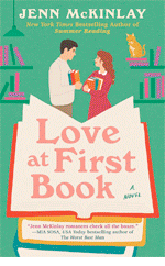
Next week, my 34thbook (A Killer Carol) will release, and I have to say that the artist assigned to this particular series hit it out of the ballpark (See: Exhibit A). In fact, when I saw just the black and white sketch at the beginning, my jaw literally went slack for the second time in my career.
Yep, A Killer Carol’s cover is, in a word, stunning.
 |
| Exhibit A |
S-t-u-n-n-i-n-g.
Now, before we move on, I need to say that I have been pretty fortunate in the cover department. The artist that designed A Killer Carol has worked on just about all of my mystery series with Berkley. She listens to my cover suggestions, actually reads the books from what I can tell, and delivers something I’m excited to see out in the wild.
But that excited-to-see-out-in-the-wild part? That hasn’t always been the case…
Back in late 2004, I was literally on the edge of my seat waiting to see the cover for my very first book, Jury of One. The book had taken me close to five years to write on account of having two little ones at home. But it found a home with a small, (now defunct) independent publisher and was set to come out in spring 2005. Because I’d spent so much time with this book, I had a very specific idea for the cover.
In my mind, I saw a nighttime setting. In the foreground was a beach. On the beach, I envisioned a body—face down—with a shadow looming above. In the background, the lights of a boardwalk beach town (ferris wheel, etc.).
As I would soon learn, that’s not the cover I got.
To make this more fun, let me set the stage for the day I saw this cover for the very first time. I’d been alerted by my editor that the cover was in the mail and so I was pretty much hanging out by the mailbox waiting. On the day it was supposed to arrive, there was no mail in the mailbox at all.
Zip. Nada.
The next day? Same thing. No mail. Nothing.
About an hour after the mail carrier usually came, we got a knock at the door.
It was the mail carrier. His mail truck had caught fire the previous day (nope, not joking) and much of the mail was either burned or damaged by the water used to put the fire out. Anything that was salvageable would be delivered on Monday.
Monday came. So, too, did a pile of mail, rubberbanded together, with one of those notes that say something along the lines of due to circumstances beyond our control (yada, yada). But in that moment, all I cared about was the singed envelope, bearing my publisher’s name in the upper left hand corner.
I pulled it out of the pile, carried it into the kitchen, ripped that sucker open, and found this (see Exhibit B)…
 |
| Exhibit B |
Felt your jaw go slack, too, didn’t you?
No nighttime scene…
No lifeless body in the foreground…
No shadow…
No boardwalk lights…
I have to admit, that the sound that came out of my mouth at that first sighting was part sob/part laugh. I mean, after the whole fire-on-the-mail-truck thing, it was hard not to look around waiting for Peter Funt of Candid Camera to walk out of my pantry.
But, alas, there was no Peter Funt.
There was just me and my pink cover… A pink cover with a green sun…
***
A footnote, for those who are curious:
1) I still have the singed envelope.
2) Jury of One was picked up by Worldwide Mystery later that year. The new cover, while better, was still nothing I’d pictured.

Laura Bradford is the national bestselling author of An Amish Mystery series, as well as the Emergency Dessert Squad Mysteries, and the Southern Sewing Circle Mysteries (the latter written as Elizabeth Lynn Casey). In addition to her work in mysteries, Laura also pens women’s fiction novels. Her latest, A Daughter’s Truth, released in May and is a Fall 2019 Book Club Pick for Mary Janes Farm Magazine.
To learn more about Laura and her books, visit her website: www.laurabradford.com.
On Facebook? So is Laura: https://www.facebook.com/laurabradfordauthor/.


Oh, my goodness . . . all that pink and a green sun??? I can feel your distress. But I must say that the “Killer Carol” cover is just amazing.
ReplyDeleteI must confess that the first thing I look for on the cover is the name of the author. Yes, I love those mysterious, haunting covers that make me simply want to dive into the book, but I still look for the author’s name first.
I can’t think of any covers that got me to buy a bad book, but there’s been a cover or two that [in my opinion] didn’t begin to do their book justice . . . .
Hi Joan! Once I get to know and like a writer, I buy by their name, too.
DeleteI look for the author's name first, too!
DeleteWow! Can't believe that first cover. The covers on your Amish mysteries have been wonderful!
ReplyDeleteI try not to judge a book by its cover, but sometimes it is very hard. Especially since some covers just scream amateur, and make me question what the writing inside will be like. Knowing the author certainly helps overcome a bad cover, however. But if all you have is that one cover and one book, it's a real challenge.
This new book is wonderful! Be sure to read it.
I'm thrilled you enjoyed A Killer Carol. Thanks, Mark!
DeleteCongratulations, Laura! That new cover hits all the notes, doesn't it? It certainly makes me want to read it.
ReplyDeleteA good cover can make me pick up a book, but cover blurb usually tells me if it's the kind of book I want to read or not. I'm in the unfamiliar place right now of working on a cover for my own first fiction publication. My sister and I recently started an independent press, and we're putting out her science fiction series, plus a developing urban fantasy series of mine, and reprinting some of my late husband's books. All from scratch. Fortunately for both of us, my sister is an artist with a lot of contacts in her field and a good eye for what works or doesn't work on the cover. I don't mind reading indy press books, but an amateur cover can be a real turn-off.
I have no idea if the cover we've designed for my story will work or not, but it's very eye-catching, and not like anything I've seen lately. It was fun working with the artist, who saw my main character a little differently than I did. She was so striking in his vision that I went with what he saw, rather than what I had originally imagined.
Gigi, I am gobsmacked! Wow! Best of luck with your independent press!! Your series, your sister's, Warren's books, and anything else you put out there!!
DeleteGood luck with your cover and book, Gigi!
DeleteGigi, the urban fantasy cover is fab! And I can't wait to see what you have in mind for the mystery in progress!
DeleteThis sounds like quite the adventure. I'm impressed!
Delete"Cover stroke." Yes, it IS a thing. Oh, Laura, that pink cover is hideous. My own cover experience has been a mix of highs and lows. I seem to like every other one. I loved the last one so am really nervous about the next one, which should be coming my way next month. I'm already getting twitchy. At least I'm comforted in knowing it will better than a pink beach with a green sun.
ReplyDeleteYour new cover is stunning, by the way! Absolutely gorgeous!
Fingers crossed that your new cover will break your every-other streak, Annette!
DeleteOh, you poor thing! Here's hoping the next cover is your best yet!
DeleteI can SO relate, Laura! My first book was also with a small Indie press. when the publisher asked my vision for the cover I told her. I envisioned seen the back of a man sitting against a tree, patches of March snow on the ground, an academic building in the background, and papers spilled out on the ground in front of the man, some spotted with blood. What I got? The protagonist jogging toward the camera in the fall. No! They wouldn't change it. That press just went out of business, and my new publisher is going to reissue the book with a new cover. Maybe my first vision will be realized this time. At least that first one wasn't
ReplyDeletewasn't pink...
I've had lots of other great covers since. And I love your new one!
By the time I got my rights back to Jury of One and put it out on e-book, I just ignored my original image, LOL! It seemed as if it just wasn't meant to be.
DeleteThis comment has been removed by a blog administrator.
ReplyDeleteYou win the big booby prize Laura--I only wish the cover had singed edges!! We saw a FedEx truck last year in Key West that had caught on fire (right before Christmas.) All the packages were spilled out the back onto the side of the road with varying degrees of fire damage. Disaster! But your cover story is even more amazing because we can imagine how expectantly you were waiting...so glad things are going better these days!
ReplyDeletePlease tell us about your new book, and also about A DAUGHTER'S TRUTH?
Lucy/Roberta, A Killer Carol is set in Amish country, of course. Claire is hard at work on the town's first-ever holiday festival when a elderly Amish couple is found murdered. Detective Jakob Fisher is narrowing in on the only suspect (s) that makes sense and it's causing some issues for Claire and their relationship. As for A Daughter's Truth, my 2nd women's fiction novel, that, too, takes place in Amish country but the main character's journey is one that is relatable across the board as it's about that moment when your whole world crumbles beneath your feet, leaving you completely directionless. The journey Emma takes to find herself again is poignant.
DeleteI have to confess that a really bad cover will cause me not to check a book out. A good cover might get me to pick up a new author, but it won't get a sale unless my interest is engaged by the blurb, the first few pages, etc. Best of luck with your new release!
ReplyDeleteI agree, FChurch. Thank you--I'm hoping the new book does well!
DeleteOh, Laura - I'm impressed that what came out of your mouth when you saw that cover was a sob instead of something unprintable. I usually talk with my editor about my 'suggestions' for the cover... they whip up maybe 3 alternatives... and I'm absolutely sure only one is serious and the others are there to make me feel as if I'm making a decision. We dicker over the color of the font and the size of my name. But they DO listen and I love my covers.
ReplyDeleteI would LOVE alternatives to choose from. Wow. But, honestly, I've been pleased with pretty much all of my covers on some level since that first one. I think starting off so bad actually helped my outlook from that point on as anything had to be better...
DeletePS: love the new cover!
ReplyDeleteThanks, Hallie!
DeleteI understand your side of things. It can’t get much more personal that writing a book and putting it out there for the vultures I mean masses.
ReplyDeleteFor me, covers are like fancy gift wrap. Nice to see, intriguing to think what might be inside, but the proof’s in the pudding. I never look at the cover again on print books and not at all on my kindle.
But that’s just me.
You are not alone in that, Ann. E-book cover art is so small as to make barely a dent in my subconscious, unless it's either very busy or very dark.
DeleteI will say a good cover will make me slow down and double back in a bookstore.
DeleteNow that I'm getting my audiobooks from an online library, covers actually matter more to me than they ever have before. I generally search by some parameters plus "Available Now', and it feeds me a LOT of choices. But their parameters aren't that defining, so I get every form of mystery there is, all lumped together. When I'm scrolling through 50 pages of available books, you can bet I rely on the covers shown to give me a hint whether it's a legal thriller or a historical mystery or a cozy mystery or what. I don't make my final selection based on the cover, but I decide when to stop scrolling and actually read the blurb based on that. (Assuming, of course, I haven't already come across familiar author names.)
ReplyDeleteVery interesting, Susan. I think I'm pretty much the same way.
DeletePretty cover. Congratulations on your new release!
ReplyDeleteThanks, Margaret!
DeleteWaving at my old friend Laura! Congratulations on your writing success. You've made a lot of people happy since that first disastrous cover. I can't believe how many books you've had published since we first met.
ReplyDeleteI designed my first book with an artist, since it was self-published. My next one, though, was a work-for-hire through the Betterway Books imprint of F&W (do they still exist? I should check.) This was a business book; I interviewed and profiled fifteen sewing business owners, nearly all of whom used professional equipment, had employees, etc. The book was entitled "How to Make MONEY with Sewing".
So you'd expect the cover to have maybe a photo of a workroom, right, or maybe someone working on a costume or fancy gown? Nope. A measuring tape, red tomato pincushion for God's sake, and a tape measure. The whole "loving hands at home" thing. That cover would actually have worked better for your Sewing Circle series, Laura. It really did not reflect the business advice inside the book.
That title did not do very well for the publisher, even though it was part of a series for them. I hand sold 90% of the books myself, and eventually had them revert the rights to me. Then instead of having them printed, I put the book into .pdf format and copied a zillion of them onto CDs, or sold them over my website as downloadable files, selling as many electronic files as Betterway sold in actual books. The cover was condensed into a CD label, and read as colorful, and not much else.
Waves back at Karen! I was thinking, while reading your description of your cover, that it would have been a good Southern Sewing Circle cover, too...
DeleteLaura, like Rhys, didn't you write romance before you started writing mysteries? If I'm remembering correctly, can you tell us why you switched genres?
DeleteAll that pink. Oy.
ReplyDeleteI've been fortunate with my two covers and gotten a lot of positive feedback on both. Of course neither look like what I thought, but it's better. I think I'm just not a graphically-inclined person.
The cover for the new one is gorgeous!
Thank you, Liz. And lol--yup, all that pink.
DeleteOh, Laura. That JURY OF ONE cover... looks like a women's fiction version of ON THE BEACH. "Would Marianne reconcile with her husband and straighten out her daughter's life before the radioactive cloud enveloped them all?"
ReplyDeleteI've been fortunate with my covers - the first editions of my first two books weren't eye-popping, but they weren't eye-gouging, either. Later editions got a re-do and a lovely unifying "slightly-ominous-landscape" look.
I have had some doozies that fortunately didn't make it out of the proposal stage. One was what my agent and I refer to as "The Vampire Cover": a beautiful young man and woman, faces in profile, with a church jammed in the lower left corner, the spire about to stick through the woman's jaw. If I ever write a tale wherein the undead attack Millers Kill, NY, we can use it, but until then, it remains mercifully on the drawing board.
A radioactive cloud - I think that's what the artist inhaled before sticking Laura with that cover. Oy.
DeleteMillers Lot. We'll be waiting for it.
DeleteLOL, Julia. Yes, it does look like that. You should bring the "Vampire Cover" with you when you give talks. Sounds like a hoot!
DeleteThat is an astonishingly bad cover.
ReplyDeleteI will admit that I let cover design influence me more than I should. As an industry professional, I know that typically authors have so little control over it and yet it is hard not to be affected by it.
This is why I will never understand the decisions by some independently published books. In those cases, I *know* the author had control, so why they wouldn't choose to spend their money wisely on cover design (and editing), I just don't know. Self-published books have an uphill battle from the start, don't make it even more difficult by slapping a horrible cover on there - some of which are, believe it or not, even worse than a pink beach and green sun.
In the end, you need to get the reader to pick up the book so they can see what is inside. Covers do matter.
I think this cover said romance. And while there was one--it was a mystery, first and foremost. That was my big issue with it at the time (and still now). Thanks for stopping by Kristopher!
DeleteI had to go back and check the date of the pink cover, cringed and the wondered if the artist was still working on covers. As established authors do you get to say "no" more often when the covers aren't what you envisioned? I keep asking myself if the cover art encourages my purchase. I don't know. Like others I'm looking for the authors I like first but too be perfectly honest, that pink and green cover would have turned me off, maybe not the picture but those colors.
ReplyDeleteI think cover art will get me to look at a book I might have passed by if the author or genre wasn't my usual. As for having a say when you're established, I don't know about everyone else, but I don't really have a say in my covers other than offering ideas and letting the art department run with them. That being said, I've been very lucky.
DeleteDeana, like Jenn said, I get to offer ideas, and for the most part they've been utilized to some degree. This was really the only cover I've had that made me cringe. It simply didn't fit the book, and it would have turned me off as a reader, as well.
DeleteFirst. Congrats on your upcoming new release. Loved Exhibit A. But B?? Moan, moan, grrooannn. Actually it kinda reminds me of how a cheapo pair of sunglasses I'd bought in the 60's made things look. Maybe that was what they were thinking. IF they were thinking. Must admit though. A cover can often make or break the buying of a book.
ReplyDeleteOh hilarious!
DeleteNot really, I agree. A cover is huge. Especially in grabbing (or, repelling) a new reader.
DeleteLaura, you definitely win the cover booby prize for that first cover. Oh my gosh. But I think you're making up some book karma with the latest cover. That book just begs to be picked up!
ReplyDeleteI've had some doozies, too, over the years. My books are contemporary British mysteries, right? So the first two covers were sort of 1930s cartoon cozy. The second one even had a cat, front and center. Granted, there is a cat in that story, which of course looked nothing like the cat they put on the cover. Then the third book was truly jaw-droppingly awful. The book is set in Henley-on-Thames, and in the Chiltern Hills west of London. A body is found in a river lock in Henley. The cover, however, was bright turquoise, with a cactus, a gravestone, and a disembodied hand reaching out of what looked like a southwestern river. I'm surprised my career didn't end right there. Things got better after that, until book #8, And Justice There is None, which is set in contemporary Notting Hill. They used a monochromatic historical photo, two figures in silhouette, standing in front of dark buildings in the snow. I ask you! They used the same photo a couple of years later on a historical novel by Andrew Taylor called Bleeding Heart Square. Much more appropriate! But I have to say my current publisher has done a terrific job on my covers and I love them!
LOL. I will have to look for that book cover with a cat. I love your book covers, though one book cover had colors blending together so it was quite challenging to read the title and your name. I may have mentioned this in an earlier Jungle Reds comment a while ago?
DeleteDiana
Holy cats, Debs. A cactus, in England? That's equal to a green sun, I think.
DeleteCasey Daniels/Kylie Logan jokes that every cover in one her cozy series had a bigger cat. The last one was gigantic.
As a reader, I mostly choose books that have been recommended to me, so the cover art is not what I am looking for. There have been many times that I have wondered what the cover had to do with the story and why it seemed so inappropriate. Now I know. I think the cover artist should have to read the book!
DeleteDriving home from a ski vacation with a close friend, my GPS refused to put us on an interstate highway, so there we were on the back roads of New Hampshire (or maybe in Vermont already) stopping to find a bathroom. The laundromat in the strip mall was the place, and the woman tending the machines there was so deeply engaged in her book that she barely could look up. She was reading Deborah Crombie's latest book and told me she'd just gotten it out of the library and had been waiting eagerly for it. She couldn't put it down. I wrote the author's name on a scrap of paper and a few months later took The Sound of Broken Glass out of my neighborhood library. Then borrowed them in order from the library. Then bought them all. Never even thought about the covers until today! Going to look for that cat, now.
Deborah, it sounds like you get my trauma, exactly. Wow.
DeleteLaura, Now that you've released books in mystery and women's fiction, which genre do you find more challenging? And do you have a preference?
ReplyDeleteHmmm, tough question, Jenn. Both genres have intrigue, it's just different. In the mysteries you have to worry about threads and red herrings and playing fair. But in the w.f. books you have to have a journey that makes sense, that satisfies, that makes the reader question, etc. So tough to answer. I just love them both.
DeletePerfect answer!
DeleteShalom Reds and fans. I don’t think about covers consciously a lot. I decided to look at the books in my Kindle app and see if I could come up with some of my aesthetic preferences. There were a few surprises. Most of my ebooks, I have not read. Many if not most of the books on my bookshelves, I have read. My favorite covers are ones that have one graphic (a picture, a painting or a drawing) almost always in color (representational and not abstract). I like the author’s name and the title of the book large enough to read at a distance of three feet. For a non-fiction book, I like a sub-title, which can be smaller, to give some indication of what the book is about. The type should not obscure the graphic. The graphic should not make the type unreadable. That said, my favorite author, in the last five years, has been Deborah Crombie and her covers break all the rules. I have eight of her books in hardcover on my shelves. Two smaller paperbacks. I have seven ebooks of hers. The type for author and title very often obscures the graphic to the point that I just give up trying to figure out what the graphic is. Those with the titles and author’s name in all caps bring to mind prison bars (looking out). Nevertheless, I have read all of them, and when the next one comes out, I will read that one.
ReplyDeleteI do become possessive of covers. Like the remakes of movies, I almost always compare the subsequent editions unfavorably to the originals.
A great thing about Debs’s books is that they are recognizable three gates away from the bookstore. That’s what I call good branding
DeleteExactly!
DeleteDavid, I reread your answer twice as I found it fascinating. Especially your general preferences (visually speaking) and how your favorite author had none of them.
DeleteGood morning from the West Coast!
ReplyDeleteHi Laura! I met you at the Bouchercon in Toronto several years ago.
Congratulations on your new novel, Killer Carol! Your Amish mysteries are among my favorites. Which actor would you cast as Jakob Fisher? Viggo Mortensen? I enjoy reading about Amish life through your novels.
The first cover with pink and green colors makes it difficult to read. The colors blend together!
Regarding book covers, I look for the name of the author first.
Diana
Hi Diana! I remember you! I'm so glad you enjoy my Amish Mysteries. I have a really tricky time thinking of actors to play roles in my book. I think some of that is because, to me, they are who they are. It seems weird to have anyone actually play them. That said, if someone wanted to make them into a movie, I'd be okay with someone playing them. ;)
DeleteI spent the night thinking about your question Bibliophile! Because really, someone would make a good Jakob Fisher. And I came up with one that I'm sharing on my FB author page later today. I think he fits the bill, visually.
Deletep.s. When I look at a book cover, I expect the art to reflect what the story is about. For example, if the story is set on a plantation in Louisiana and there is a dog in the story, then the cover art reflects that. If the story is set in the Amish community, then I expect to see a horse and buggy art on the cover. Maybe Amish clothes?
ReplyDeleteDiana
I agree!
DeleteI'm so sorry! After reading the description of your first book I looked at the cover and just groaned. What the heck? Are you sure they didn't switch covers with a romance novel? I do look at covers after title and author name. I am amazed at how many covers don't really match up with the story. Oh! It just hit me! I've read all your Amish mysteries and thoroughly enjoyed them. And now you have another one coming out? Heavenly. Sorry my brain is not functioning today. We just had the pest control man out doing a spot treatment for those *%#! dry wood termites. I can't wait to read your latest!
ReplyDeleteThank you, Pat! So glad you're enjoying the series--I think you'll love this new one. As for the thought on the cover, at the time, when I questioned it, they said "chick lit is big right now." I pointed out it wasn't a chick lit book. The response was "chick lit is big right now." I think we made that loop about 5 times before I finally realized I wasn't going to get it changed.
DeleteI am such a big fan of book covers. I even have books about book covers. Hahaha! Seriously though, I have a book on Penguin covers and a book on children's book covers. I probably have a couple more, too. And, since I have lists for everything, I have a list of favorite book covers, too, although it hasn't been updated for some time. I need to get back to that. I will buy different copies of a favorite book or favorite author for the different covers, especially the U.S. and U.K. covers of some of my favorites. Having mentioned Penguin covers, there are covers that they have come out with for some of the classics that I've collected, such as the more recent Penguin Threads, Penguin Horror, and Penguin Couture collections. Occasionally, after already loving and buying the hardback edition of a book, I'll be equally enthusiastic about the paperback edition's cover, so I have given in to temptation there, too. I wish I had a room in my house in which I could display all the great covers of books I've collected, where they could be seen in their full cover glory.
ReplyDeleteLaura, that first cover must have been quite the disappointment, but A Killer Carol is so gorgeous, and looking back at your other covers for this series, they are all wonderful. Congratulations on A Killer Carol!
Thank you, Kathy! I love looking at a book's different covers, as well. The large print alone are always so vastly different than the original publisher.
DeleteA cover may influence me to pick it up off the shelf, but as I've said before, it is the blurb on the back that becomes the deciding factor in whether or not I'll pick it up. You gotta hook me with the synopsis of the story. All the pretty artwork on the front goes for naught if the story doesn't hook me.
ReplyDeleteAnd I have to agree that Exhibit A is fantastic while Exhibit B is just plain scary bad!
I'm really curious to watch how Exhibit A does on the shelves starting next week just based on the artwork. I'm curious to see if new-to-me readers will pick it up.
DeleteOh rats! Sometimes I think so much about posting that I think I posted! When actually I only thought about posting. Grr. This is an amazing story, sadly however, not unusual! I had my first publisher, who I adore, give me a cover for my second book that made me burst into tears. Absolute tears. I will not describe it, but the name of the book was FaceTime, and the cover looked more like it should be called Chest Time. I will let you imagine what it was, and just to say, there was no face on the cover. They fixed it.
ReplyDeleteToo Funny. Let me guess, the artist was not a woman.
DeleteThis made me laugh out loud. And then still more with Judy's response...
DeleteI’m lucky because I work in a library so I get very familiar with all the cozie covers and I will tell you that I can usually recognize who has written a book just based on the cover art, if they use the same artist for a whole Series anyway. So I look for My familiar art and then look for the authors name.
ReplyDeleteI've had the same artist for two of my series. When a different series came out with the same company, I knew, the moment I saw the first cover, it was someone different. Still good...but just a different person doing it.
DeleteWow that would have been a stunner to see. Who does that? That cover is just not right. Now I have to admit ever since I was a child, I judge books by their covers. The only think I do that way. And your covers are always amazing!! I love, love, love the new one about to come out!! It is amazing!! So happy things have gotten better for you in that department, lol
ReplyDeleteI tried to respond to you but it put it at the bottom of the page and so I deleted it and am trying again... :) Yes, Kayt18, things did, indeed, get better in that department. Phew...
DeleteWhile I buy my favorite authors' books no matter what the cover, I do use them in choosing new authors along with the blurbs. I love the covers and look at them often. I bought a color Nook because of the covers and regret that I only see them on the main page, the library or shopping. With print books, I look at the covers often, even when rearranging my TBR piles.
ReplyDeleteSally, it is fun to look at good covers, isn't it?
DeleteWonderful! It’s great to know that your stories will be available for everyone to read.
ReplyDeleteI have a question for you and all the authors, legal question I’m an attorney.
Are all of you incorporated or putting your book/ and publishing rights in sone form of limited liability company?
Those of you traditionally published, who negotiates for you with your publisher?
Attorney or agent or both?
Is control of the cover art and book title nonnegotiable with publishers until you’ve had a lot of success?
The above comment was a reply to Ms. Norwood’s comment, it was published in the wrong place!
ReplyDeleteThis comment has been removed by the author.
ReplyDeleteA huge thank you to the Jungle Reds for hosting me today, and an extra special thank you to Jenn for inviting me. I had a blast!
ReplyDelete