Showing posts with label cover art. Show all posts

Friday, September 5, 2025

The Evolution of a Book Cover

 JENN McKINLAY: I may or may not get into trouble for sharing the evolution of my most recent book cover. Maybe I should ask first but I long ago discovered it's easier to get forgiveness than permission.

So, my upcoming 2026 romcom THE SUMMER SHARE just had its big cover reveal. It came out great I'm thrilled, but how did we get there?

About a year out from publication, my publisher always asks what I want on the cover. Given that this is a story about two people who inherit a cottage in the Outer Banks only to discover when they get there that it's a shared inheritance, I knew right away I wanted a cottage on the cover, a beach, our heroine, our hero, and the heroine's Great Dane named Dude, or "El Duderino, if you're not into the whole brevity thing" -- bonus points if you can name the movie that quote comes from!

Being ever helpful, I sent my publisher a mock up (with notes) of what I thought the cover could look like.


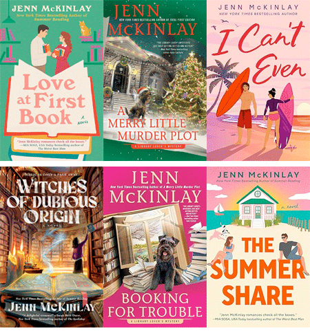
There was some debate about changing the cover from my previous  romcom styles (see my website for examples). It's the old debate about whether or not "cartoon" covers were out of fashion, etc. Given that I write comedy, I feel like a cartoon cover is a good heads up about what you're going to get but what do I know?

A couple of months passed and I received three options for the new cover. Wow!


How great are these? I sent them to everyone I know (the Reds can testify this is true) and asked for help with choosing. I mean, they're all amazing. I felt like I was tasked with the impossible. The colors on book one dazzled, the blue water on book two was so inviting, and the cottage with the couple sitting on the title was ridiculously charming. After several weeks of debate, my editor and I picked our favorite elements from the covers and sent our thoughts back to the art department. And this is what they came back with: Perfection!

PRE ORDER NOW (May 2026)

You can see the final is vastly different than the mock up I sent in and yet it captures the vibe I was hoping for. This is why I'm a writer and not a cover artist. 

So, what do you think, Readers? Did the art department do right by me? There is no wrong answer here as art is purely subjective.

More about the book:

When two misfits discover they’ve inherited the same beach house, sparks fly in the most unexpected ways, in this hilarious and heartfelt rom-com from the New York Times bestselling author of Summer Reading.

Free-spirited travel influencer Hannah Spencer has spent five years touring the country in her vintage van. An unexpected inheritance from her Pops brings Hannah to Cape Split, North Carolina, where she learns she’s the new owner of a worse-for-wear seaside beach house. Or, rather, fifty percent of one. Turns out Simon O’Malley inherited the other half from his Gramps.

As Simon and Hannah spend the summer tag-teaming repairs on the crumbling cottage, they discover the house was once home to a timeless love story. Soon, they begin to wonder if the house’s romantic past may be a good omen for their future together. But there’s one problem—Simon is set on selling the property at the end of the summer.

Hannah thought one summer at the Split would be enough, except it isn’t like any place she’s ever been, and Simon isn’t like any man she’s ever known—and she’s thinking about putting down some roots. She just needs Simon to see their budding relationship and this newfound community the same way or their first summer share might also be their last.

Thursday, February 11, 2021

A Scone of Contention, Cover Reveal! @LucyBurdette

LUCY BURDETTE: Far in advance of a published book, I receive an email from my editorial contact at Crooked Lane, asking for ideas about the cover art, including a summary of the plot. That email came in August for A SCONE OF CONTENTION, which will be in stores next August. 

I always have ideas about the cover, as by this point most of the story is written and I've been collecting photos all along. I began to picture what scene might be most evocative. Much of Scone takes place in Scotland, with a pivotal scene in the gorgeous but forbidding mountains around Glencoe. So I suggested those mountains, along with tartan plaid, a plate of scones, and the requisite cat. (Remember that since this is a cozy foodie mystery series, there does need to be food on the cover, along with some suggestion of menace, and the cat. The cat is pretty much mandatory--even though the characters are in Scotland, and Evinrude, Hayley's striped tiger, is at home in Key West.) Here's what came back:


My first reaction when I saw the draft was that the artists did not use my ideas. But the more I looked, the clearer it became that they did exactly what I asked for. I had been picturing a small table set up in the mountains--almost like a picnic (which doesn’t really fit with the plot but it’s fiction.) The artists (Griesbach/Martucci) put the table with baked goods inside, looking out on the gorgeous Scottish scenery. Which is perfect! Here's the tiniest bit of the Glencoe scene:


Helen was waiting for me on the deck in back of the building, but there was no sign of Miss Gloria.


“Is she coming?” Helen asked, looking behind me and adding a laugh. “I’ve never seen anyone so excited about choosing the right gifts for her friends. She is such a treasure. I hope I have half of her energy when I get to her age.”


“I lost track of her,” I said, peering around the deck and getting an uneasy feeling. I was the one who’d been fooling around in the gift shop, not Miss Gloria. I hadn’t noticed her in there at all. I tried to think where she would’ve gone. 


“Maybe she started off on the nature trail on her own? Or maybe she saw Vera and went with her? Or probably she made a stop in the rest room.” 


But the slight uneasiness I'd noticed was developing into a sick feeling in the pit of my stomach. My friend had been quiet all morning, never so quiet as during and after the little film that described the massacre of the MacDonald clan. I should have stuck closer to her, not spent so much time perusing recipes. I should have noticed signs that she might be troubled.


“She’s probably gone looking for the ruins of the cottage,” I said. “And that worries me because she takes these emotional things so hard.”


We studied the map describing the various nature trails and took a narrow path carpeted in grass in the direction of the ruins, where the farmers of the MacDonald clan had lived in the late 1600s. As we drew closer, we saw piles of stones covered in moss and lichens that would have been the foundations of their cottages. 


My heart rate began to rise as I heard a terrible moaning noise. In the distance near the green stones, I spotted Gavin trotting toward the noise from the opposite direction. But no sign of Miss Gloria.


Readers: How important is a cover when you're considering whether to buy a book? I wonder if this is different for people who read hard copies vs ebooks? Are you ever bothered that the cover doesn't reflect the content?


A SCONE OF CONTENTION can be preordered now. And if you're a Netgalley/Goodreads etc reviewer, the ebook is available for download

Tuesday, September 17, 2019

Let's Talk Book Covers by Laura Bradford

JENN McKINLAY: Yay!!! One of my very favorite author pals is popping in today, and I love her post so much. It's the twisty turny tale of cover art and what it does to authors. Except Laura's story is crazier than most! Here she is to tell it as only Laura can...

LAURA BRADFORD: I can’t speak for all of my fellow writers, but I suspect I speak for many when I describe that moment right before you see your latest cover for the first time as nerve-racking. Because, as we all know, people do, in fact, judge a book by its cover. Granted, different covers speak to different people for different reasons, but they do speak and they speak loudly. 

They can also incite nightmares and trauma, but we’ll get to that…

Next week, my 34thbook (A Killer Carol) will release, and I have to say that the artist assigned to this particular series hit it out of the ballpark (See: Exhibit A). In fact, when I saw just the black and white sketch at the beginning, my jaw literally went slack for the second time in my career. 

Yep, A Killer Carol’s cover is, in a word, stunning

Exhibit A

S-t-u-n-n-i-n-g.

Now, before we move on, I need to say that I have been pretty fortunate in the cover department. The artist that designed A Killer Carol has worked on just about all of my mystery series with Berkley. She listens to my cover suggestions, actually reads the books from what I can tell, and delivers something I’m excited to see out in the wild. 

But that excited-to-see-out-in-the-wild part? That hasn’t always been the case…

Back in late 2004, I was literally on the edge of my seat waiting to see the cover for my very first book, Jury of One. The book had taken me close to five years to write on account of having two little ones at home. But it found a home with a small, (now defunct) independent publisher and was set to come out in spring 2005. Because I’d spent so much time with this book, I had a very specific idea for the cover.

In my mind, I saw a nighttime setting. In the foreground was a beach. On the beach, I envisioned a body—face down—with a shadow looming above. In the background, the lights of a boardwalk beach town (ferris wheel, etc.).

As I would soon learn, that’s not the cover I got. 

To make this more fun, let me set the stage for the day I saw this cover for the very first time. I’d been alerted by my editor that the cover was in the mail and so I was pretty much hanging out by the mailbox waiting. On the day it was supposed to arrive, there was no mail in the mailbox at all.

Zip. Nada.

The next day? Same thing. No mail. Nothing.

About an hour after the mail carrier usually came, we got a knock at the door.

It was the mail carrier.  His mail truck had caught fire the previous day (nope, not joking) and much of the mail was either burned or damaged by the water used to put the fire out. Anything that was salvageable would be delivered on Monday.

Monday came. So, too, did a pile of mail, rubberbanded together, with one of those notes that say something along the lines of due to circumstances beyond our control (yada, yada). But in that moment, all I cared about was the singed envelope, bearing my publisher’s name in the upper left hand corner.

I pulled it out of the pile, carried it into the kitchen, ripped that sucker open, and found this (see Exhibit B)…

Exhibit B 
Felt your jaw go slack, too, didn’t you?

No nighttime scene…

No lifeless body in the foreground…

No shadow…

No boardwalk lights…

I have to admit, that the sound that came out of my mouth at that first sighting was part sob/part laugh. I mean, after the whole fire-on-the-mail-truck thing, it was hard not to look around waiting for Peter Funt of Candid Camera to walk out of my pantry.

But, alas, there was no Peter Funt.

There was just me and my pink cover… A pink cover with a green sun…

 JENN: I have no words and, just so we're clear, that never happens! If "cover stroke" was a thing, I'd have had it.

***

A footnote, for those who are curious: 

1)   I still have the singed envelope.  
2)  Jury of One was picked up by Worldwide Mystery later that year. The new cover, while better, was still nothing I’d pictured.

So, how about it, Reds and Readers, what's your take on book covers? Any horror stories? Any covers that got you to buy a bad book? What do you like to see in a cover?


Laura Bradford is the national bestselling author of An Amish Mystery series, as well as the Emergency Dessert Squad Mysteries, and the Southern Sewing Circle Mysteries (the latter written as Elizabeth Lynn Casey). In addition to her work in mysteries, Laura also pens women’s fiction novels. Her latest, A Daughter’s Truth, released in May and is a Fall 2019 Book Club Pick for Mary Janes Farm Magazine
To learn more about Laura and her books, visit her website: www.laurabradford.com.