DEBORAH CROMBIE: The REDs are such a busy, productive bunch--some of us are turning out two, three, or FOUR books a year! Honestly, this just boggles my mind, and I suffer from a constant case of underachiever syndrome.
I wrote my first four books in a year each, but then as the books got longer and more complicated, I got...slower. Enter the latest, Kincaid/James #19, and with the lack of research trips combined with all the general pandemic worry and muddle, my progress has been GLACIAL.
HOWEVER, the end is now in sight!!!!!!!!!!! Like the tortoise, I will get there, and in just a few more weeks. Excuse my messy desk, but that pile of pages is starting to look like a book!

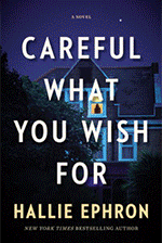
I have a COVER, too! And as the book is up for pre-order here and here, I'm going to share it with you!

I think it's fabulous. It's exactly what I imagined for this book, and I especially love that the image is the Bloomsbury Tavern, one of the oldest pubs in London. The Bloomsbury was once the ominous final watering hole en route to the hangman's noose at Marble Arch. Isn't that perfect for a crime novel?


But this was not arrived at instantly, I can tell you. Covers are very much a collaborative effort. I wanted a book that said Bloomsbury. My photographer friend in London even spent an afternoon shooting locations in the area for me, but nothing quite worked. I especially liked the idea of using a pub, but every place he checked had big Covid-restriction signs in the windows, and all the passersby were masked. Not photogenic at all!
But eventually, between my agent, my editor, the publisher's art department, and me (spending many hours on Google Images,) we came up with the image above.
I want to walk right in that open door.
So of course I had to set a scene in the Bloomsbury, but I'm only going to share a couple of sentences, because otherwise it is a SPOILER. Even in this little snippet, I've substituted pronouns for the proper names. This far along in a story, anything can be a spoiler!
He set a quick pace down New
Oxford Street, and when she spotted the triangular, ornately embellished red
brick building with its green spire, she guessed where they were
going. “The Bloomsbury Tavern.”
“Can’t get much more un-trendy
than this,” he said as they reached it. “And the beer is better.”
Welcoming light spilled from the pub’s distinctive leaded windows, and when he opened the door they were met with a wave of warmth and the comforting smell of chips frying.
Readers, do you like authors to have a "brand" with their cover designs? My first five books were with the same publisher, but the cover design and concept of each one were completely different. The next three books, different publisher, same problem--and one of the covers looks like an historical novel. Such a shame as it's one of my favorite books in the series, AND JUSTICE THERE IS NONE. (The same art work did show up a year or so later on another author's Victorian-set novel!)
After that, my first few covers with William Morrow were fun because we used my photos. But, then, with NO MARK UPON HER, we moved to a "bigger book" (as they say in the publishing business) design.

What do you think, REDs and readers? Does it look like a Gemma and Duncan novel? And do you notice if an author's covers have a certain style?


I do love this cover, Debs, and I’m really looking forward to reading the story.
ReplyDeleteI don’t have any particular preference for covers of books although I do like the consistent covers from the past several books [and, yes, they certainly do say Kincaid/James].
Thank you, Joan!
DeleteI do notice if there is a consist style, at least within a series. Some authors change up styles with a new series. Not being quick to accept change, I might not love a change in style mid-series right away, but it often quickly grows on me.
ReplyDeleteI totally get that, Mark. But I hope the design of the last several books has grown on people!
DeleteOh Debs, I love the cover for your new book! It absolutely says Gemma and Duncan novel to me. I like the two different colors for your name and the title, too, with the red for the title matching the red of the "New York Times Best Selling Author" line. I don't know that I've ever told you, but I have been trying to complete my collection of hardbacks in your series for the past several years. I think I'm down to either two or three, probably two. It's the early ones that have been more difficult, of course.
ReplyDeleteThere are some favorite authors whose covers I've come to expect a certain style from, ones I really like. I'm someone who loves book covers, and I'm often drawn to a book because of its cover. I just read Heather Gudenkauf's The Overnight Guest, and I had to laugh at myself. The cover had me hooked immediately (and luckily the novel was amazing) with a house in the dark in a snowstorm. I'm a sucker for snow scenes on covers.
Kathy, all those little details you noticed are things that are discussed in the cover process. We tried this cover with all the type in red, and with all the type in white, as the previous books in this design series have kept all the lettering in the same color. I also love that the red picks up the color in the geraniums in the pub's hanging baskets.
DeleteOne iteration had the type in the pinky-purple color that's also in the geraniums. That was really striking (and was my daughter's favorite) but I was afraid the color combination made it look like a horror novel. There are so many things to consider!
PS email me about those books!
Oh yes, the red in the hanging baskets matching is a lovely, subtle touch. I'm really glad you went with the red in the letters, too, and not the pinky-purple color. Of course, that one probably looks better than I'm imagining it.
DeleteI want to comment, too, on one of the aspects of your books that is mention in other comments, that of different parts of London coming alive for the readers. I know I'm beating the same old drum, but I still dream of a Gemma and Duncan tour of London. I'm thinking a a special tour set up just for that.
This comment has been removed by the author.
ReplyDeleteDEBS: The new cover is great! However, I personally associate Bloomsbury with the British Museum, academic societies (I found the Royal Geographic Society while strolling the area) and green spaces/squares instead of pubs. I remember eating/drinking at all while in Bloomsbury.
ReplyDeleteThat is so interesting how the Kincaid/James book covers have changed/evolved with different publishers. Yes, I can recognize your recent hardcover books by their consistent use of the same capitalized fonts, and use of a photo.
GAH! Meant to say "I DON'T remember eating/drinking..."
DeleteGrace, this pub is very close to the British Museum, and one character actually has a job at the museum, although we never see her at work. Bloomsbury has so many associations to choose from; the Bloomsbury group of writers and artists, which included Virginia Woolf, Vanessa Bell, Leonard Woolf, Lytton Strachey, and John Maynard Keynes. Rupert Brook had a brief association with them, as well. Dorothy Sayers lived in Bloomsbury, as did Charles Dickens, for a time. Bloomsbury has also long been associated with rather dowdy hotels, although I'm not sure that's true these days.
DeleteDEBS: I don't remember the dowdy hotels but I can see Bloomsbury being a haven for the artistic type.
DeleteIt absolutely looks like one of your books, Debs. I have noticed that the more well-known the author, the bigger their name and the smaller the title. And you have made it!
ReplyDeleteI have loved all my Kensington covers, and they keep the look and feel consistent within a series.
Yes, name bigger than the title is a thing, and I do believe it works subliminally!
DeleteI love the cover and it does look like your books, Debs.
ReplyDeleteI will admit to liking it when all of an author's books, at least within a series, "match" style.
Yes, me, too. I wish all my hardcovers were consistent, but as the older books are out of print, I doubt anyone cares but me!
DeleteI cannot wait to read your book! Glacial pace, although agonizing for us waiting for the next chapter in Gemma and Duncan's adventures, pays off in the quality of your work. Worth waiting for. Lovely cover.
ReplyDeleteI hope you will enjoy it, and I appreciate your patience!
DeleteHooray hooray hooray! And oh yes, I think your books are absolutely instantly recognizable! And the covers are quite perfect. It’s a great moment to get your new cover, isn’t it? It makes it feel like a real book. Congratulations, tortoise, you always make it to the finish line in time. Xxxxx
ReplyDeleteAgreed. Tortoise or hare, I love reading all the REDS.
DeleteHank, your covers now are terrific, and they SHOUT Hank Phillip Ryan book!
DeleteCongratulations Debs! Love the new cover and I can't wait to read the book xox
ReplyDeleteSoon, Roberta, soon!!!
DeleteCongratulations! Like the cover and can't wait to read and learn more about Bloomsbury, an area of London I don't know well.
ReplyDeleteBloomsbury is fascinating, with so many associations as I mentioned to Grace above. I had thought more of the literary connections would work their way into this book, but the book didn't cooperate!
DeleteCongratulations, Debs! What a beautiful cover! Perfect and I cannot wait to read it.
ReplyDeleteThe cover is striking and consistent--I do notice styles of covers. But, honestly, once I discover an author I love, you could wrap the books in brown paper and I wouldn't care. Can not wait to read A KILLING OF INNOCENTS!
ReplyDeleteThank you, Flora!! I hope it doesn't disappoint!
DeleteIt won't. Authors sometimes make choices (or the story forces choices) that are just killers for the reader--when a character dies or is killed off, when lovers break up (here's looking at you, Julia and Deborah), etc., but that means the author has done their job well when you hurt as a reader--they've made you care about the characters. Can't really anticipate any disappointments from any of the REDS truly.
DeleteOh, Deb, I am so happy that pre-orders are open. Just took care of that so now, I can relax and know #19 will hit my kindle on release!
ReplyDeleteBecause I read on Kindle, covers are not as important to me as they were. I do check them out for every book though, and I like the feeling of comfort that continuity provides. Yes, the cover for A Killing of Innocents looks exactly as I would expect a Kincaid and James cover to look.
Thank you for the preorder, Kait! Much appreciated! My editor is very happy with the preorders so far. We did wonder if this cover would have enough pop for the e-book thumbnails.
DeleteKAIT: I agree with you about the book covers on Kindle.
DeleteI only own hardcover & paperback Kincaid/James books, so I'm not sure how this cover would look on a B&W Kindle (app).
Congratulations, Debs! The cover looks great and definitely says Kincaid/James.
ReplyDeleteI like it when an author's books have a consistent look because it just makes it that much easier to notice them. I do a lot of reading on audiobooks, and often just go into my library's database and scan through the "currently available" list with a few other filters on. It can be easy to skim right past something good, and having that visual cue that this book is from a favorite author helps. Back when I used to frequent bookstores more frequently (in the before times) the same logic applied.
Yes, I read/listen to a lot of audiobooks, too, and I really like books in a series to be easily recognizable. Although I do hope we will get back to scanning displays in bookstores again one of these days.
DeleteAnother worry Jane Austen never had, what kind of photo her publisher used on her cover.
ReplyDeleteAnd now I'm wondering when photos and other illustrations began to be used on covers of books other than those for children.
I didn't know your photos had been used for some of your covers, Debs. How fun is that? Like Rhys's sketches ending up in The Venice Sketchbook. Your books do tend to have a "look", which makes them easier to find, and nicer to display together on a bookshelf.
However, other than to get a quick, almost subliminal understanding of the genre of a book, I rarely pay attention to covers. It would be incongruous to have a candy-colored illustration on the cover of a Duncan and Gemma book, as it would be to have a moody and dark one on a Key West mystery. And as Kait points out, most of my reading now is done electronically. Both Kindle and Nook display the cover images, but they're often too small to really scrutinize for detail.
Yes, they used my photos from In a Dark House through Necessary as Blood. It was terrific fun. Who knows, we might do it again, when I can actually get over there to take them!
DeleteSo exciting! I just pre-ordered my copy.
ReplyDeleteYay! Thank you so much for the preorder!
DeleteI love the cover, and it is all about branding. Otherwise Coca Cola would come out with something new and different every year or so. And what about Target? So simple but you can't miss it. So I do like this in books, easy to identify. And fine to do different themes in different series. As long as it is recognizable.
ReplyDeleteOff to order my copy. Lord knows I've waited long enough. See you in Minneapolis and in Texas in September.
Yay, Ann! You're coming to Texas!!! Let me know your details!
DeleteI notice when the author's name becomes larger than the book title and when the title is below the author name, especially on the spine. It does that a bit to get used to the cover design changes but is a show of longevity so that's a good thing. Glad the finish line is in sight, I've missed visiting England through your books.
ReplyDeleteDeana, I finally got over being cranky over what I couldn't do and started enjoying what I could do, i.e. lots of time with Google Street View. :-)
DeleteWith every Kincaid/James I virtually visit a location that was #1 on my travel list. Thank you for taking me there, Debs. I think the classier design of the cover carries through with the format, the font and even the pages have a good 'book feel'. I am thrilled that Duncan and company will be spending time with me soon. To be hones, I would go for your work no matter what the dust jacket looked like. Deborah Crombie is all that I would need to know.
ReplyDeleteThank you, Coralee. I'm hoping this book will give everyone that sense of being in London.
DeleteAnd I have to say that I think my publisher does a beautiful job with all aspects of the books.
I like the consistent brand for covers. It's part of the experience.... and so many crime/police procedural/detective novel have similar covers in terms of the font choices and the overlay on the picture - but then i can tell quickly if i want to have a closer look.
ReplyDeleteThere are so many things to consider. You also want to tempt the reader who might not necessarily read those kind of books, but if the message is too ambiguous, you may miss the crime/detective novel fans...
DeleteI love the cover! Every time I see it in my Nook library I check to see when the book will be there. Thanks to you I have traveled virtually to some very lovely places and had great adventures. Can’t wait for m next “trip”. Thank you for Gemma and Duncan, et al.
ReplyDeleteAnn, I hope you enjoy the virtual trip as much as I've enjoyed writing it!
DeleteCannot wait to read the newest! And I love the cover. It does, indeed, shout Deborah Crombie in the best kind of ways. I love reading that you have so much input with the cover design, that's not always the case is it?
ReplyDeleteThank you, dear Kaye! And, no, it's not always the case. I was just looking at the recent covers and wondering why I ended up with the London Eye on the cover of To Dwell in Darkness. Surely I must have protested--I mean, the book is set in St. Pancras Station and what could be more photogenic than that?
DeleteDEBS,
ReplyDeleteThe new cover looks better than the last book with the glaring yellow cover and the white lettering, which made it hard to see the words. The new cover is an improvement, though the red color of the letters may be a challenge for someone who is color blind. I like a book cover with the title colors in big contrast to the background.
Still, I liked the older books with different covers because the title and your name was easier to see.
Looking forward to reading your new Duncan and Kincaid mystery novel! Love that photo of the pub.
Diana
Thanks, Diana!
DeleteI am just excited it's coming. I found your books at the library and it was Water Like A Stone. The cover attracted me and the slipcase copy drew me in. Once I finished, I went looking for more. I am fine with covers in a series being different, but it does seem the current trend is to have a similar style throughout. Might feel differently if you were writing multiple series as then it helps easily recognize where it belongs. Can't wait to see where you go next!
ReplyDeleteThanks, Mary! I loved the cover of Water Like a Stone. That was one of my photos!
DeleteSorry to be so late today, but finally relaxing in the passenger seat on our way north. Maybe we'll pass the laundromat where one of your fans was reading your latest book several years ago. When she didn't look up to see who'd come in to use her lavatory, I had to know what she was reading. And here I am, years later, looking forward to your next book myself.
ReplyDeleteI love the new cover. It's stunning. I guess I do like it when a series has a consistent look but I'm not sure that I even thought about it before I began hanging out with all these "booky" people. I love JRW, Debs! XXOO
That's a great story, Judy!! And I'm so glad you like the cover!
DeleteI'd like to pre-order from a bookseller where you can personalize my book!
ReplyDeleteI'm sure some of the lovely indies like Murder by the Book and The Poisoned Pen will have signed and personalized copies. Maybe I will even get to sign them in the stores!
DeleteCongrats on that beautiful cover! Also, way to keep going with the writing--here's to crossing that finish line soon!
ReplyDeleteThanks, Jennifer!!
DeleteLove the cover and can't wait for the book!
ReplyDeleteThanks, Sarah!
DeleteOh, this news makes me very happy! Stay calm and keep writing. I have loved all of your covers and I like the consistency of them. It is nice to be able to find them on the shelves, both mine and the booksellers, with ease. Also, it gives a collection the right feel. Now, I am going to find some of the older ones to re-read.
ReplyDeleteI need "Stay Calm and Keep Writing" on my mug:-) I cannot wait to see the actual finished book.
DeleteI've absolutely loved the covers of the last group of "bigger" books, and the librarian in me is so much happier that they all "match" on my bookshelves here at home! I can't wait to read your latest - will head over now to Amazon to purchase my pre-order copy!
ReplyDeleteWe aim to please the librarians, for sure!
DeleteLove the cover and very excited about the book. I have been missing Duncan and Gemma.
ReplyDeleteI do love the new cover! I do pay attention to book covers. Thanks for sharing. Can you tell us if this book will have a map? I always enjoy the maps in your books.
ReplyDeleteI think Laura Maestro will be doing a map, but I will know more soon. I certainly hope so!
DeleteI love that cover and would love to join Gemma for a little libation and a chat right there. I'm not so very concerned about books matching, but I have a niece who declared that one of her OCD areas. I care about the story . . . and I'm willing to wait for yours, champing at the bit but aware that art takes time. <3
ReplyDeleteThanks, Mary! I'd like to join Gemma for a little libation, too! Let's pick a place!
DeleteLate getting to the blog today, but YES to consistent book covers. I have loved your recent book cover styles. They're perfect. And of course I love the stories inside. Congrats on almost completion.
ReplyDeleteThank you!
DeleteLove the cover and excited to read the book! A fan from way back! Forgive the nitpick-ery but "distinctive" appears twice describing aspects of the Bloomsbury Tavern in the short excerpt you provided. I don't think the second one is needed.
ReplyDeleteThank you! That's what happens when you're writing fast. I will fix it!
DeleteI can't wait for this and am hoping to be in London in June so will go visit the Bloomsbury Tavern in your honor.
ReplyDeleteYes, I do notice if the publisher sticks with a certain look. I also notice if the trim size changes dramatically, which often happens after the first book or if the author switches publishers. Maybe they don't look as pretty on my shelf but my pleasure is undiminished!
Oh, yes, I love the cover, and I am shivering with anticipation to get this book! I'm just thankful you have stuck with the same characters as they kind of feel like a second family to me, though that probably sounds weird! They are so real I feel like I know them, down to their pets, and I love them and want to see how their life goes. Yours is the most anticipated new book for me, and I'll be preordering!
ReplyDeleteI just noticed it says publication date February of 2023!?!? I thought it was to be this summer. Say it ain't so!
ReplyDeleteI can't wait for the new book and I have to say I don't pay too much attention to the covers. However, I love this picture and the idea of a book set in Bloomsbury. When I studied overseas as a college student, our hotel in London was on Gower Street, very close.
ReplyDeleteI ended up with 2 copies of And Justice There is None, so the cover didn't stop me from buying it twice :)
Debs, your books are always worth the wait. Always!
ReplyDeleteI love the cover!! I am headed to London in a few months and was thrilled to find out that the tour group will be staying at the Thistle Holborn. I have now added the Bloomsbury Tavern to my itinerary. Are there other "must see" Duncan and Gemma places? BTW, I love the maps in your books.
ReplyDeleteI think your covers are very distinctive--I recognize them instantly. And this one is perfect. I am so looking forward to the book.
ReplyDelete