
Writers..we yak about our covers endlessly, but who do we talk to? Each other mostly and what do we know?
Today we're getting the chance to listen to someone who actually has some of the answers.
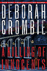
Jungle Red welcomes David Baldeosingh Rotstein, Art Director of Minotaur Books/Palgrave Macmillan, Senior Art Director, St. Martin's Press
DR: Hi Rosemary. Thanks for giving me the opportunity to share some thoughts about the book cover design process.
JR: So, first question..How busy are you? We all know lots of books come out every month - how many covers do you work on in an average year?
DR: Hi Rosemary. Thanks for giving me the opportunity to share some thoughts about the book cover design process.
JR: So, first question..How busy are you? We all know lots of books come out every month - how many covers do you work on in an average year?
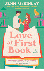
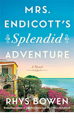
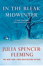
DR: It’s hard to believe, but I work on well over 150 book covers a year. Some of the covers I design personally, while others I Art Direct. A few colleagues have said that I am the busiest Art Director in New York.
Working on so many projects is certainly challenging, but it has great benefits as well. It requires me to streamline my thinking and trust my instincts. It also gives me the opportunity to work on many kinds of books ranging from mysteries and novels, to biographies and cookbooks. It’s a very stimulating environment for creativity.
JR: I doubt it's possible, but do you read every book that you work on?
DR: All of the books I work on are read in some measure. I need to read enough of a book to understand how to package it.
Books are like people. Sometimes you get a sense of a person within two minutes of meeting them and feel like you’ve known them your entire life. Other personalities require more time and closer examination before you can begin to uncover a core message. This issue is not exclusively a function of the writing style alone, but is also determined by my experiences and familiarities. Sometimes the great idea comes to me on page one, and those covers are just as powerful as ideas that took longer to develop.
Another thing to realize is that book covers are always communicating with an audience that has not yet read the book. I typically need to pull myself back and pretend that I know nothing about the book. Over the years I’ve had so many covers where the payoff to the cover was contingent upon having read a certain passage. This approach is one that authors and editors love because they are so close to the project, but it’s not an approach that targets the real audience.
JR: I adore the cover for Dead Head and can't seem to stop slapping it on postcards, bookmarks and other promotional materials, but what happens if the great idea doesn't come?
JR: I adore the cover for Dead Head and can't seem to stop slapping it on postcards, bookmarks and other promotional materials, but what happens if the great idea doesn't come?
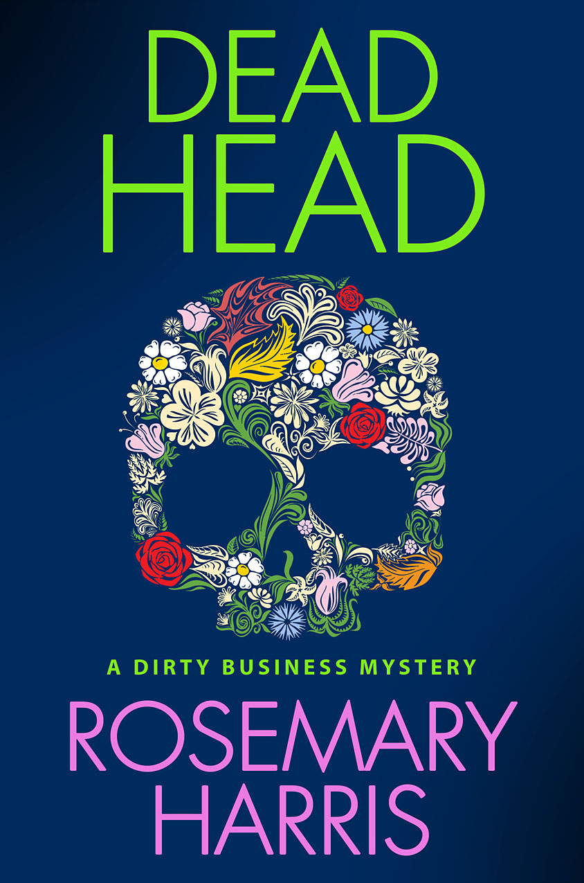
What's the longest amount of time you've ever spent designing a cover? (Please don't tell me it was Dirt Nap)
DR: Six months of design is probably the longest span. Some books literally have dozens of versions of a cover. Dirt Nap is certainly on the list, but it is not even close to being among the longest ones.
JR: I'm really glad to hear that! (I have to add if the title of the book had not been changed, the process might not have been so torturous. But, I digress...)
Is there one cover that you are most proud of?
DR: I’m always most proud of solutions where I succeed in trying something new or increase my scope and range. I couldn’t possibly pick a favorite cover, there are just too many.
Your book Dead Head would certainly be on that list though, because it was a new kind of solution for me.
JR: Well, Death Will Get You Sober by Liz Zelvin ranks as one of my favorites..how did you come up with the idea for your dramatic, Anthony-nominated cover? 

DR: I wanted to feature a drink but my initial versions of the glass spilling or falling were too static and lacked the sense of energy and violence that I was seeking. So I explained the idea to my photographer and had the image photographed with a high-speed strobe.
JR: Very cool. I'm just about to finish my fourth book and I've already got some ideas for the cover! What information can the author give her publisher to help the art department?
DR: It’s very helpful for authors to communicate what they like, especially if they have strong ideas. But if an author does not feel covers are their strength, then it can cause difficulty. Comparison book jackets can be great. Saying “I want the cover to feel like an Ella Fitzgerald song” can speak volumes.
My favorite questions are: Who is the audience for this book? What emotion, mood or tone should the cover convey? Should the cover feel epic and sweeping or intimate and precious? Dark and moody or bright and sunny? Masculine or feminine?
Authors can also be very specific: photography vs illustration? Full bleed artwork vs small spot art? Or one can suggest a specific a scene to depict, or a conceptual idea.
I have two big cautions. One is to avoid the cover trying to do too much: it can’t be funny but also serious (even though the book itself has both aspects). The best packages focus on one.
Caution two is to not feel that you have to try to come up with cover ideas yourself. Professional graphic designers and art directors struggle to create their solutions. If you are struggling with the cover (or even if you’re not), then don’t be afraid to simply ask the art director figure it out.
JR: David, thanks so much for visiting and JR readers if you have any questions for David, fire away because in the time it took you to read this blog David has already gotten another book cover to design. Check in over the weekend for comments and questions.


As one of the lucky recipients of David's genius, I just gotta say... reading about the process was fascinating!
ReplyDeleteJust wanted to thank Rosemary for this interview, and thank David for being here. As a new St. Martin's author, I can hardly wait to see my cover art (and I haven't even finished writing the book)!
ReplyDeleteHi, David, it's great to hear about your process. I still think your cover for Death Will Get You Sober deserved the Anthony. I was equally thrilled with your next cover for me, with its New York street and taxi theme. Since I learned you really shot the glass, I've been dying to ask you: Did you really have the words Death Will Help You Leave Him painted on the street on Park Avenue? Or was it computer graphics?
ReplyDeleteYour covers are visually striking and definitely help to sell the books.
ReplyDeleteQuestion: cozy/traditional mystery covers often include a lot of detail. Does that small scale help or hurt the shelf appeal of a book?
I have always loved my Minotaur covers and recieved great comments on them, especially the latest--The Last Illusion.
ReplyDeleteIt's great when the publisher listens and is on the same page, so thank you.
My first David cover art was for THE CONJURER. It still wins raves. Visually beautiful, haunting, evocative and compelling. It not only launched the series, but made a proud author stare in wonderment at her alter-ego, heroine Martha Beale, who gazed back from the book's front jacket. We were finally face to face!
ReplyDeleteThank you, thank you!
Wow! 150? My mind boggles. But many thanks to you and your team for my two great covers for Posed for Murder and Dead in the Water. I'm so thrilled that the second actually looks like it was shot from Grand Street Park in Williamsburg, Brooklyn (where lots of the action takes place). The cover is already getting lots of raves.
ReplyDeleteDavid - I have noticed that each year, just like in fashion, some colors are in and some are out. All the YA books right now, for example, are screaming PINK. Seems like last year (or the ear before) we had a raft of orange and black thriller covers. Do you notice fads? What's hot right now?
ReplyDeleteAnd can you comment on the difference in cover aesthetic for a hard cover versus mass market printing of the same book?
Enjoyed the interview and a bit of an inside look at the job of the Art Director. The cover for Death Will Get You Sober is stunning and I can see why it won a major award.
ReplyDeleteI remember searching for just the right image for the cover of an annual report I was working on once. I sent my photographer out on the freeway to take a picture of an old cathedral with huge steel girders behind it for a high-rise going up. My client was The Catholic Foundation, and our theme for that report was Strength and Solidarity. I though the image captured that.
It is such a thrill when that happens. And kudos to the photographers who will go that extra mile to help.
When I received the cover for my book (THE MURDERER'S DAUGHTER'S, released Jan 2010 from St. Martin's) I wrote so many thank-you emails that I began teetering on the edge of stalker/author.
ReplyDeleteI still look at the cover in awe and gratitude each day.
Hi David,
ReplyDeleteIt's fascinating to hear how you search out the nature of the book to create the right cover to attract readers. I hope you're working on mine as we speak--SWIFT JUSTICE, due out 23 Sep. Thanks for stopping by JRW to give a little insight into a part of the business I know little about.
Great interview David and Rosemary! My agent has always referred to "cover fairies" so it was fun to see who's really wearing the wings...
ReplyDeleteI am delighted to have found such a beautifully illustrated blog.
ReplyDeleteMinotaur publish very fine books and it is very interesting to read the interview with Mr Rotstein.
Regards from Dublin, Ireland.