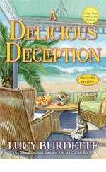
LUCY BURDETTE: Far in advance of a published book, I receive an email from my editorial contact at Crooked Lane, asking for ideas about the cover art, including a summary of the plot. That email came in August for A SCONE OF CONTENTION, which will be in stores next August.
I always have ideas about the cover, as by this point most of the story is written and I've been collecting photos all along. I began to picture what scene might be most evocative. Much of Scone takes place in Scotland, with a pivotal scene in the gorgeous but forbidding mountains around Glencoe. So I suggested those mountains, along with tartan plaid, a plate of scones, and the requisite cat. (Remember that since this is a cozy foodie mystery series, there does need to be food on the cover, along with some suggestion of menace, and the cat. The cat is pretty much mandatory--even though the characters are in Scotland, and Evinrude, Hayley's striped tiger, is at home in Key West.) Here's what came back:

My first reaction when I saw the draft was that the artists did not use my ideas. But the more I looked, the clearer it became that they did exactly what I asked for. I had been picturing a small table set up in the mountains--almost like a picnic (which doesn’t really fit with the plot but it’s fiction.) The artists (Griesbach/Martucci) put the table with baked goods inside, looking out on the gorgeous Scottish scenery. Which is perfect! Here's the tiniest bit of the Glencoe scene:
Helen was waiting for me on the deck in back of the building, but there was no sign of Miss Gloria.
“Is she coming?” Helen asked, looking behind me and adding a laugh. “I’ve never seen anyone so excited about choosing the right gifts for her friends. She is such a treasure. I hope I have half of her energy when I get to her age.”
“I lost track of her,” I said, peering around the deck and getting an uneasy feeling. I was the one who’d been fooling around in the gift shop, not Miss Gloria. I hadn’t noticed her in there at all. I tried to think where she would’ve gone.
“Maybe she started off on the nature trail on her own? Or maybe she saw Vera and went with her? Or probably she made a stop in the rest room.”
But the slight uneasiness I'd noticed was developing into a sick feeling in the pit of my stomach. My friend had been quiet all morning, never so quiet as during and after the little film that described the massacre of the MacDonald clan. I should have stuck closer to her, not spent so much time perusing recipes. I should have noticed signs that she might be troubled.
“She’s probably gone looking for the ruins of the cottage,” I said. “And that worries me because she takes these emotional things so hard.”
We studied the map describing the various nature trails and took a narrow path carpeted in grass in the direction of the ruins, where the farmers of the MacDonald clan had lived in the late 1600s. As we drew closer, we saw piles of stones covered in moss and lichens that would have been the foundations of their cottages.
My heart rate began to rise as I heard a terrible moaning noise. In the distance near the green stones, I spotted Gavin trotting toward the noise from the opposite direction. But no sign of Miss Gloria.
A SCONE OF CONTENTION can be preordered now. And if you're a Netgalley/Goodreads etc reviewer, the ebook is available for download.


This is a gorgeous cover, Lucy!
ReplyDeleteSometimes a cover captures my attention, but I have to read the blurb before I decide if I’m buying the book . . . unless, of course, it’s a Jungle Red writer’s book . . . then I don’t have to do anything except grab the book off the shelf :)
I can’t think of a time when I was annoyed about the cover not reflecting the story.
Although hard copies are always my preference, lately, I find myself reading more eBooks than usual. I think NetGalley is to blame for that . . . but I do like having the opportunity to read books early.
This scene really shows how much Hayley worries about and watches over Miss Gloria . . . it was fun to see her character so prominent in the story . . . I loved this book!
thank you so much Joan--we are so appreciative of your enthusiasm and early reviews!
DeleteSounds good. And looks good.
ReplyDeleteAs much as I will claim that the cover doesn't influence me, it can influence me with an author I don't know. Once I know I like the author, it isn't nearly as big a deal for me. But a cover will catch my eye and then I'll pick up the book to read more on the back.
that makes sense Mark
DeleteI'm exactly the same way, Mark. An intriguing cover - or one that says "this is the kind of book you like" - will get me to pick it up in the bookstore or look it up, if I'm online. That's also why I don't complain about covers looking alike, despite the fact we'd all like special, unique images on our own books. If I like books about people dealing with family issues while vacationing on the coast of Maine/Nantucket/Cape Cod (and I do!) I want to see a cover with girls' legs* in the sand with the water in the distance. They're all like that, and that's good.
Delete*the legs are still attached to the girl or girls. If otherwise, it would be a completely different book.
LOL, Julia!
DeleteOh, Lucy, you can't leave me hanging like that! I am really excited about reading this one set in Scotland. And, I'm so glad Miss Gloria is there, too, although now I'm worried about her. I have it through Net Galley, but I have a couple of books I have to read for review before it.
ReplyDeleteI am a fan of great book covers. Like most everyone else, a cover doesn't influence me if I already read the author, but I have definitely bought books for their covers before.
Thanks Kathy for caring about Miss Gloria! and reading and reviewing. I would say covers do a big job if I'm browsing in a bookstore...
DeleteRoberta/Lucy, the cover is wonderful, I love it. Your covers always are so colorful. I may be tempted by a certain cover, but usually buy books because I like the author or because I have heard about the book, especially if I heard about it here. Also, I follow series.
ReplyDeleteHayley's adventure in Scotland is one book I have been looking forward to reading. Although I am sure Miss Gloria will be okay, I need to find out.
thanks Judy!
DeleteThat cover is gorgeous!
ReplyDeletethanks Annette, I'm so lucky to have those artists working on the series. they get better and better...
DeleteWhat Kathy said - you can't leave us hanging there! I'm really looking forward to this book.
ReplyDeleteAnd the cover is perfect. Julie Hennrikus is also leading a cover description over at the Wicked Authors blog today. We agreed that our cover artists don't get the town/yard/restaurant exactly right, but that our covers are perfect for our series.
that's the thing Edith, they can't really see what we see in our minds, but they know how to appeal to a reader!
Delete"No sign of Miss Gloria"??? AAAAAGH!
ReplyDeleteThe cover is completelyh gorgeous. Scrumptious and scenic. Question: I always thought plaids were specific to different families. Is that so, and was there any discussion when picking the particular design of the plaid on the cover? Curious minds...
It's true, Hallie, and I love our red-and-green Maxwell tartan. All the menfolk in my family have ties in it, plus a toddler vest I made for my sons carefully packed away for a grandchild...
DeleteThere is a whole catalogue of clan tartans, including one recently specially created for a Middle Eastern family that now lives in Scotland. Many clans have both dress and hunting tartans. The hunting ones are dull so that the hunter blends more easily into the surrounding area, similar to camouflage.
DeleteIt's not exactly right, but the tartan on the cover looks like Dress Stewart.
The Citadel has a special powder blue and grey tartan that is worn by their regimental band, which includes kilted bagpipers, and it's available from the school gift shop by the yard. I once thought about buying some for my alumni daughter, but it is sky-high spendy stuff.
And as far as I know I have no Scottish heritage. Nor does the family friend who wears a very fancy kilt and dress blazer with the full regalia--including flashes on his knee socks and sian dhu (stubby knife) tucked into one of them--as his evening dress. But it's fascinating history.
Deletethanks Hallie! And yes I sent a photo of the plaid I hoped they would use. I think I sent them the Macdonald tartan, from Miss Gloria's ancestors. this doesn't match that exactly but it pops so perfectly. Heres a tartan finder if you get interested: https://www.lochcarron.co.uk/tartan-finder/
DeleteThis comment has been removed by the author.
DeleteTartans are fascinating. I did a lot of research when I lived in Scotland. If I remember now, Crombie is an offshoot of the MacDonald clan and uses the MacDonald tartan. AND the Gordon tartan. There is also a corporate Crombie tartan, created for the Scottish makers of Crombie overcoats. Such fun!
DeleteROBERTA (LUCY): The book cover is great! Like others, if I already read the author, the book cover does not influence whether I will read it. But if I see an enticing cover from an unknown author, I will at least check out the book by reading the description/back cover.
ReplyDeleteAnd I do have a Netgalley ARC of A Scone of Contention to enjoy reading soon.
Wonderful. thank you Grace!
DeleteBook covers are important in so far as, browsing through the bookstore, they catch my eye. Once caught, I look at the cover for a clue about both the content (story) and the sensibility (tone, genre, etc.) of the book. If it doesn't all add up from the cover, I am disappointed. With ebooks, I miss the colour of the print-book cover.
ReplyDeleteDo tell us about why a cat is always on a cozy cover!
that's a good question Amanda! I think the cat telegraphs the cozy nature of the book.
DeleteAh, ok. Well, it makes perfect sense to me. What could be more cozy than a cat and a book?
DeleteI spy a trend here--yes, covers catch my attention, but if a book is by a favorite author, it could be wrapped in brown paper and I'd still take it. And I have been annoyed by cover art that doesn't reflect the content. It goes along with the labeling of books as this or that sub-genre, I think--a too-cutesy cover with a grisly murder inside, for example. This has NOT happened with Reds' books!
ReplyDeleteAnd I could really get into a tip to Scotland about now, especially with some of my favorite characters. Guess I'll have to put that trip off until August--maybe I'll have my vaccinations by then!
trip to Scotland, that is.
ReplyDeleteMe too on the trip to Scotland, sigh. It really helped lift my spirits to be working on this during the pandemic!
DeleteOh, can't wait! The cover is gorgeous!
ReplyDeleteCovers do influence me when I'm reading hardbound or paper. A cover may encourage me buy a book, but it won't dissuade me from buying one unless it features something completely abhorrent to me. Does that make any sense? I find I search for my ebooks by author or clicking on links in blogs or other electronic programs so the covers play almost no part in my ebook library.
Yes that makes perfect sense--I miss the covers on ebooks too.
DeleteWhen I open an ebook, it always opens to the first page of the story. I usually scroll backwards through the first pages that ARE there, including the bookcover, just to see the dedications and also if the author wrote an opening note!
DeleteThis cover is absolutely perfect! I love it. And they did follow your instructions, perfectly. Congratulations. And oh, the plaids. When I was a little girl, I used to look at the color plates of the different tartans are n the World Book and try to decide which clan I would have been in based on which tartan I liked the best.
ReplyDeleteAnd I know Miss Gloria had to be just fine, but this is still very worrisome… :-) Love it!
Hank, that sounds like a game I definitely would have played! I guess I kind of did that here LOL!
DeleteJust a nerdy note, "plaid" is actually the length of fabric worn over the left shoulder in Scottish dress. The plaid will have a tartan design. Confusing, no?
DeleteTruly a beautiful cover, Lucy! Uusually I am not influenced by covers and I have been known to be very annoyed when something on the cover doesn't match the story - didn't they read the book, I always wonder and found out recently that no, they weren't required to read the book! Huh!
ReplyDeleteTrouble with eBooks is you don't get to spend much time with the cover, but that could be me. I really don't know how to easily flip from place to place, which is one reason I prefer an actual book in my hands.
This is a great book with a wonderful story but it begs for pictures!
So true, they don't read the book first--they don't have time! Wouldn't that have been fun to have photos??
DeleteOh, and as for covers! I have absolutely purchased books…well, not based on the cover, but let’s say encouraged by the cover. My attention is drawn to it, Which makes me more likely to choose it or be curious about it.
ReplyDeleteIt's gorgeous, and will stand out in a lineup of your other books, which tend towards more tropical colors. This one has a slightly different feel, perfect for a story based in Scotland. It draws you right in, too.
ReplyDeleteCovers sure have changed over the decades, haven't they? I have a lot of older books, and cozy covers, in particular, have gotten much more complicated. I'm thinking of Diane Mott Davidson's and Joanne Fluke's older books, also about food, and they are largely single color background with a relevant motif, like a candy cane dripping with blood, or a chocolate cake with a dagger in the center. I wonder when that evolved.
The only aspect of a cover that would put me off reading a book is if I did not want to read the genre it represents. And I think today's covers more accurately telegraph the genre than ever before, do you agree? Not always perfectly, as Flora mentions, above, but in general.
But I'm curious, why is it imperative to include a cat?
Yes I agree they telegraph the genre very well these days. I think a person could write a dissertation on how covers have changed over the years!
DeleteI'd actually read such a dissertation!
DeleteThat would be a genuinely interesting monograph, wouldn't it? There's been a noticeable change in romance covers since the bodice ripper days, and I've heard the reason the early paperbacks featured heaving bosoms was to entice the men who were responsible for bringing them into drugstores, etc. and stacking them on paperback racks (remember those?)
DeleteI'm surprised with so many books being sold (or marketed) online that cover designs haven't gotten simpler, seeing as how many are only viewed as small photos. But that doesn't seem to be the case.
Julia and Karen, let's do that in our spare time??
DeleteI would read it!
DeleteYou're on, Lucy! I need a project.
DeleteCongratulations! The cover artists did a great job.
ReplyDeleteWith domestic thrillers center stage, I'm amused by their more abstract covers: the overturned bicycle by the side of the road, the car door left open, the figure in a raincoat or bulky parka disappearing into a snowstorm or the night.
Margaret, I had one like that! A house in a snowstorm with the door left open. It actually happens in the book, and the artist (and marketing people) thought it conveyed menace.
DeleteCertainly a menace to your heating oil bill... :-)
Oh my goodness, I love the cover!! It is perfect :) I can't wait to hold the actual book in my hands and relive that wonderful trip through your characters' eyes!! Does anyone lose their luggage in the book? Poor Steve lol!
ReplyDeleteNo one loses their luggage!
DeleteBecause of accessibility, most of the books I buy are Ebooks and the covers are not an incentive.
ReplyDeleteWhen I go to the public library, covers can catch my eyes but I will read what’s about before taking it.
If I had never read your books, the cover of A Scone of Contention would have caught my eyes and the appreciation from Diane Mott Davidson would have clenched the deal.
Not sure I said it right, so I’ll add: for me, as I love your books, no need of a cute cover or of Diane’s approbation.
DeleteThat's so good to hear, thanks Danielle!
DeleteI'm a visual person, so I always look at the cover first and then I read the back cover to see if there's a hint that pertains to the cover image. Most of the time it is aligned. That said, I love this cover and the yellow hits the spot.
ReplyDeletethanks so much Dru Ann! It is different from the others in the series, but then the book is different too
DeleteLucy, I think the artists made a good choice - the view from inside is cozier, and the symmetrical framing elements (curtains, food platters, tartan, table legs) create a very pleasing effect.
ReplyDeleteI'm wondering if you have any worries, or if there were any conversations, about this cover being so different from the other Key West Food Critic mysteries? Not that it's not a lovely cover - it is! - but that a reader might not connect it at first or second glance with the series? I realize that was always going to be an issue, because if there's anything that's the direct antithesis to the tropical Florida look, it's Scotland...
We did not discuss that. I did ask the head honcho and my agent what they thought about a book set in Scotland, and both agreed it should be ok this far along in the series. Fingers crossed!
DeleteI think the consistency of the design still telegraphs "Haley Snow/Key West book."
DeleteOne of the things I've noticed since I got my Kindle has been that covers look different in black and white. Well, duh, right? Except that I get ads for books I might actually find interesting in color, that just look dull, cliched, or stupid in black and white. So I don't buy the e-book.
ReplyDeleteYour cover will translate well to black and white, Lucy. I've been looking forward to this one for a long time.
thanks Gigi, you are hired to work on the book cover monograph too!
DeleteLucy,
ReplyDeleteSince the pandemic started, I have been borrowing ebooks from the library. I can look up the definition of a word that is new to me on my iPad/ebook. However, I still have a lot of print books at home and I can use my post-it notes on the pages if I want to look for a quote.
That cover of your new book is gorgeous! I thought perhaps there was someone in Scotland who had a cat that looks like Hayley's cat? I wonder if they have similar cat breeds in Scotland? And the title is just perfect! I like that word Scone in the title.
Scotland is among my favorite places to visit. It is so beautiful there.
Diana
It is a gorgeous place. That cat on the cover is definitely Evinrude. There are 3 other cats in the story, but they didn't make it to the cover. Two of them are owned by my friend Bunnie Smith, who bid on me using the winning person's pets in an auction for the FL Keys SPCA
DeleteI'm about to speak words of blasphemy here, so I will understand if you all throw stones. But I have been dismayed by the current trend in covers for cozies. To me, they all look alike any more, and what they look most like is the end of the cozy spectrum that I least enjoy. Thank God for this blog pointing out some really great cozy authors, because when I see cover after cover with a prominently placed cat and food, I anticipate the book is going to be one of those saccharine-sweet stories where everyone is too cute by half and it's just a piece of mindless fluff. Don't get me wrong -- I enjoy MANY cozies, and many of them prominently feature food -- and sometimes pets. I love the cozies written by all of you Reds. But as I said, I just don't like the direction the publishing houses have taken with covers. I think they've made most cozies look alike and made it harder to select one.
ReplyDeleteInteresting Susan, I'm glad to get your opinion. I'm afraid the marketing departments follow trends more closely than they should!
DeleteLike others, once I know and enjoy the author's work, I don't always look at the cover. But I do look FOR the cover if an artist and author have established a style when creating the book's covers during the length of the series. Easier to pinpoint the book on display, in the store, then I can browse, see what else catches my eye. Being a creature of habit, it can get frustrating when the artist or style change, for whatever the reason.
ReplyDeleteCan't wait wait to travel to Scotland.
thanks Deana!
DeleteLucy, I love the cover! I would absolutely buy this book based on the cover alone. Covers will catch my eye so they are important but a catchy title can, too. Also, if the author is one I adore - like you - then the name recognition is enough. Congrats on this brilliant cover!
ReplyDeletethanks so much Jenn--the credit goes to the artists!
DeleteI don't pay much attention to covers of authors I already read, however some will always catch my eye. I'm drawn to the newer trends in covers: cartoons, drawings, silhouettes and "retros". So many covers look alike I think they're churned out by the same people. At any rate I have to read the blurb if the cover did not catch my eye. I loved the excerpt, Lucy, and will be reading my Netgalley copy in the coming weeks!
ReplyDeletethanks Pat!
DeleteLucy, I think the cover is just perfect! And I love the excerpt. I think you've captured the emotional impact of Glencoe--I remember I cried when I visited years ago. And now I can't wait to see who was moaning and whether Miss Gloria is all right!
ReplyDeleteIt's such a stunning place with a moving story--one of the highlights of the trip for sure!
DeleteIt's a lovely cover, Lucy.
ReplyDeleteLike others, a cover isn't a factor in buying for me, but it does influence if I pick it up to check it out (or click on the Amazon read-inside or whatever).
And yes, it does bother me when the cover doesn't accurately depict the story. If, for example, picked up this book and got a psychological suspense, I'd be irritated. False advertising, if you will.
agree with that Liz!
DeleteI use the cover in selecting new authors but I love colorful covers in all my books. My Nook is a color one, and the main screen shows the covers as does the library and the shopping screens. While I don't read every cozy that is out, I do like the covers with food, pets, crafts, gardens, etc.
ReplyDeleteAnd it does bother me when the cover is different from the book, especially on major things. With paper books, I often check the cover as I read. Stay safe and well.